
Summer.
On your plate.
A bowl full of life. A handful of expressive leaves. An identity that turns fresh greens into a bright, playful invitation.
- Client
- Pina Salata
- Our role
- Brand concept
Logo & visual identity
Illustration & brand graphics
Application concepts
Fresh food.
A living character.
“Summer on your plate” connects fresh greens with the colour, variety and pleasure of summer. The identity begins with a familiar serving bowl, then gives it a lively personality.
The design question was how to express that feeling with a simple symbol — and how to carry it from a small packaging mark to a large street poster.
From a plate
to a living story.
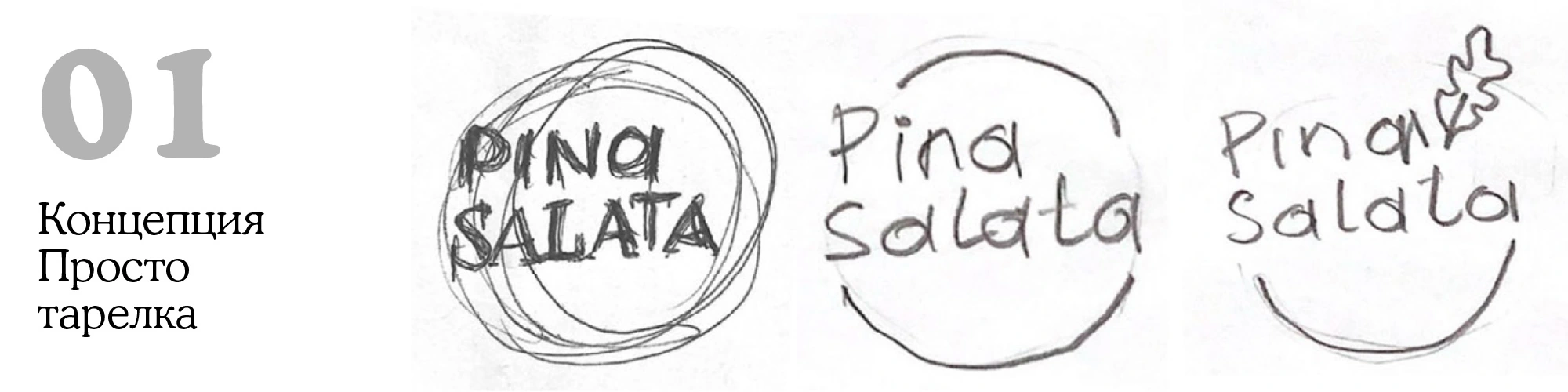
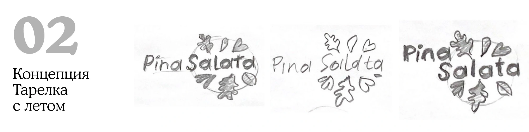
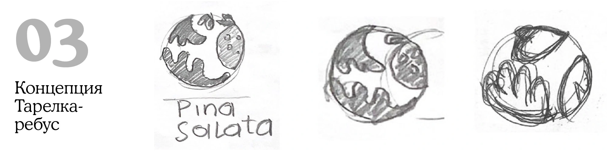
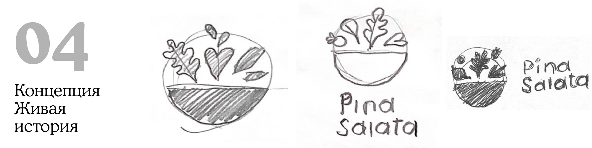
The original drawings explore four directions: a simple plate, a plate filled with summer, a circular puzzle of leaves and berries, and a bowl with a living composition of greens.
The final route lets the ingredients break free of the bowl. Their different shapes and colours make the mark feel fresh and spontaneous while the serving shape holds it together.
A generous bowl.
An expressive name.
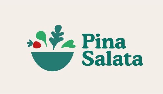
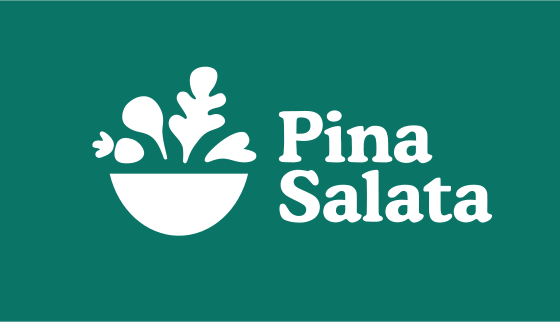
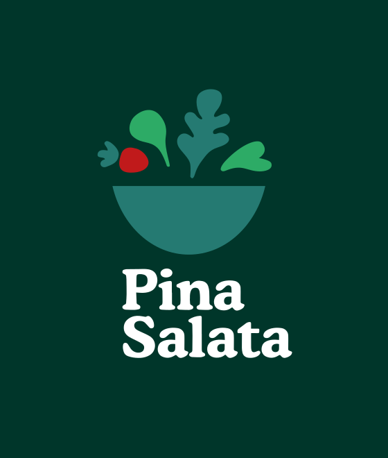
The mark combines a simple bowl with a loose arrangement of greens and a red accent. Soft, substantial lettering balances the irregular shapes above the bowl.
The system includes a full-colour horizontal signature, a white version on green and a compact vertical arrangement for darker backgrounds.
Small ingredients.
A bigger language.
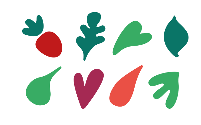
The vegetable shapes become a graphic vocabulary in their own right. Rounded leaves, a branching stem and bright red accents can be separated, enlarged and recombined.
On a bag or a vehicle, a few oversized forms create recognition from a distance. The smaller logo signs the composition rather than carrying the whole design.

Green at heart.
Colour in every leaf.
Teal and deep green ground the identity. Leaf green and red bring the ingredients forward, while warm neutrals sit comfortably beside paper and natural packaging materials.
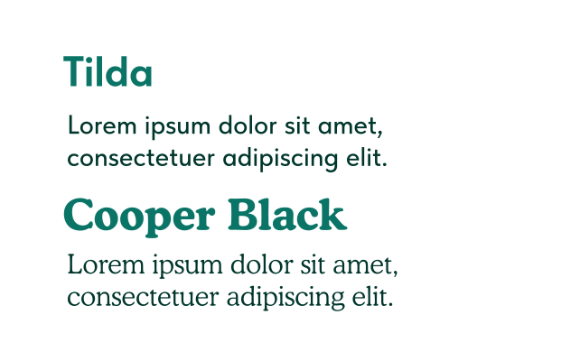
Cooper Black gives the name and short headlines a generous, rounded voice. Tilda provides a clear contrast for supporting information.
Original palette / Greens, produce accents and warm neutrals.
Made to carry
a little summer.
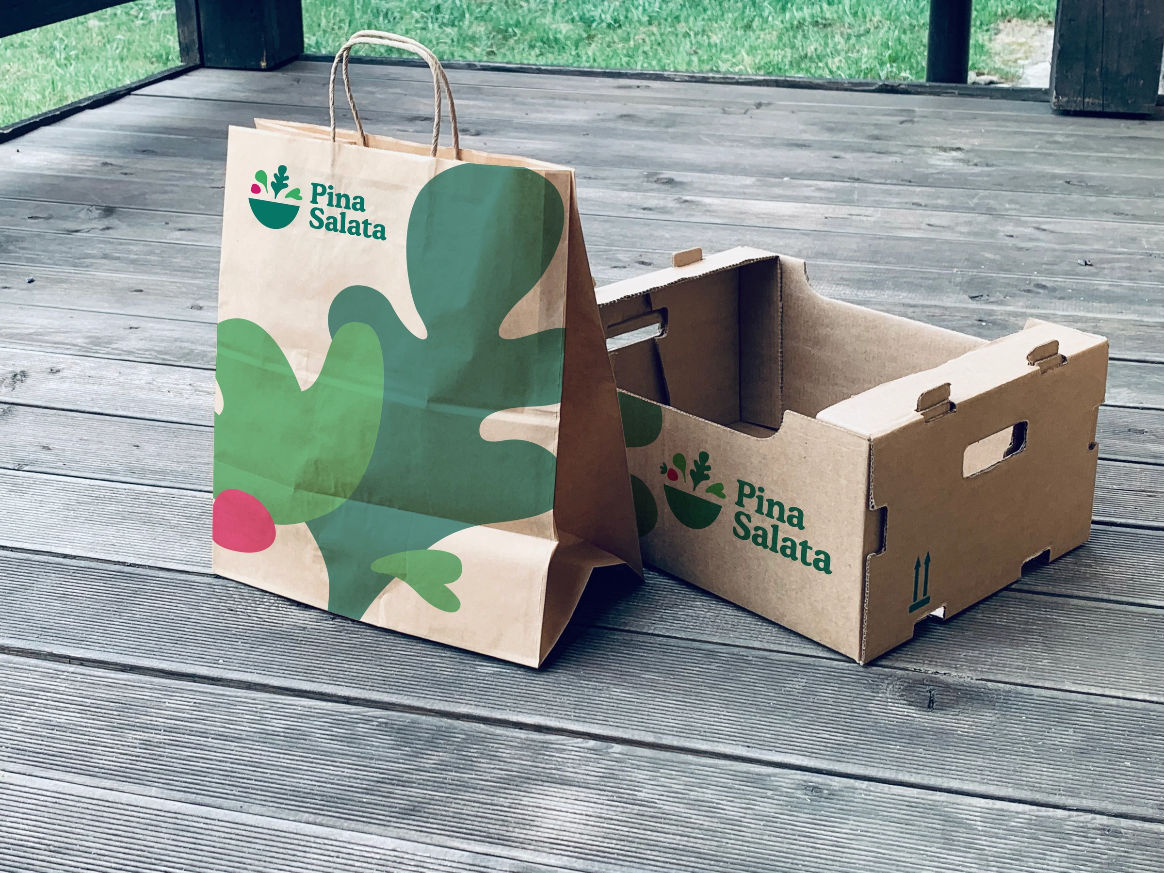
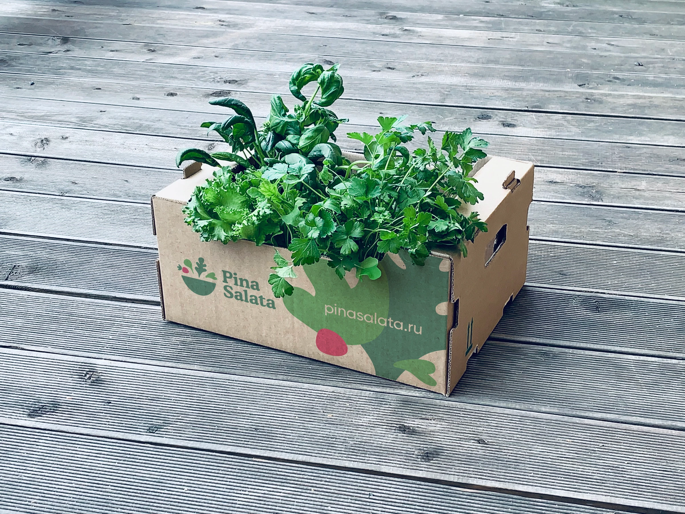
On the produce box, the small signature sits beside the greens themselves. On the paper bag, oversized leaves turn an everyday surface into an unmistakable piece of the identity.
The same ingredients work at different scales: a compact mark for recognition, large shapes for character, and a clear green field to connect them.
Freshness,
out in the open.
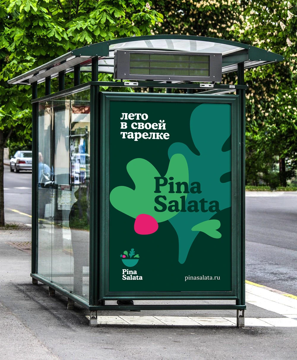
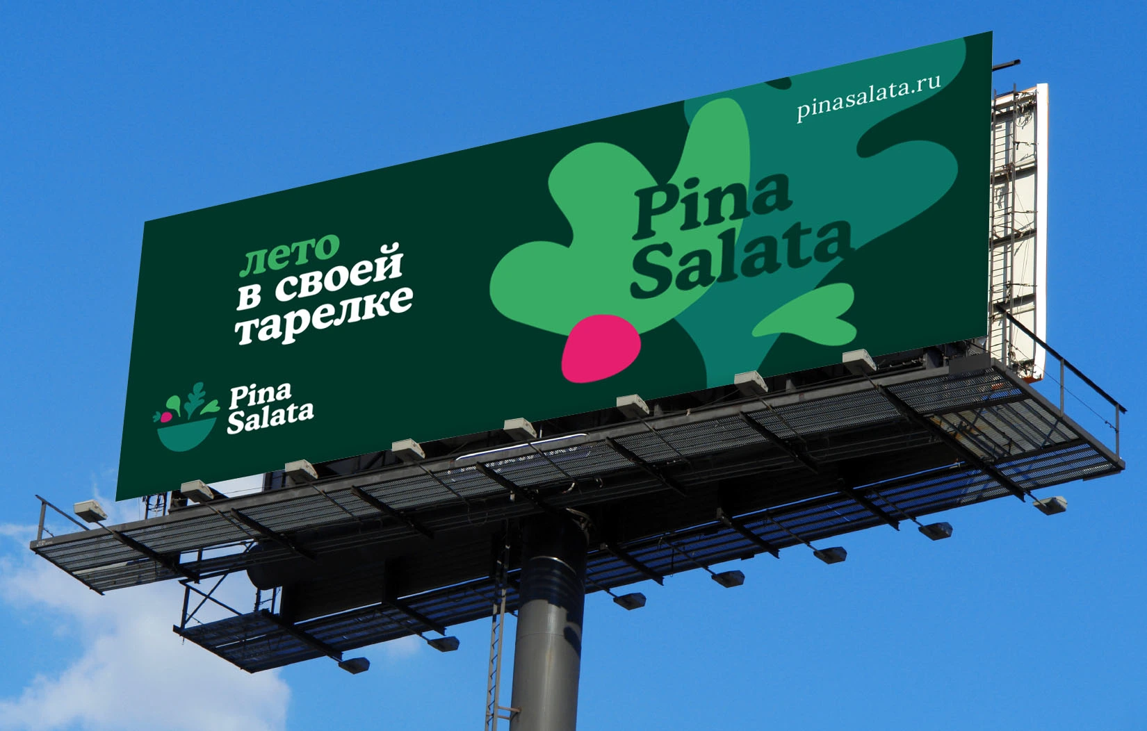
The original outdoor concepts pair the Russian line “Summer on your plate” with a bold composition of leaves. The artwork stays simple enough to read at street level and at billboard scale.
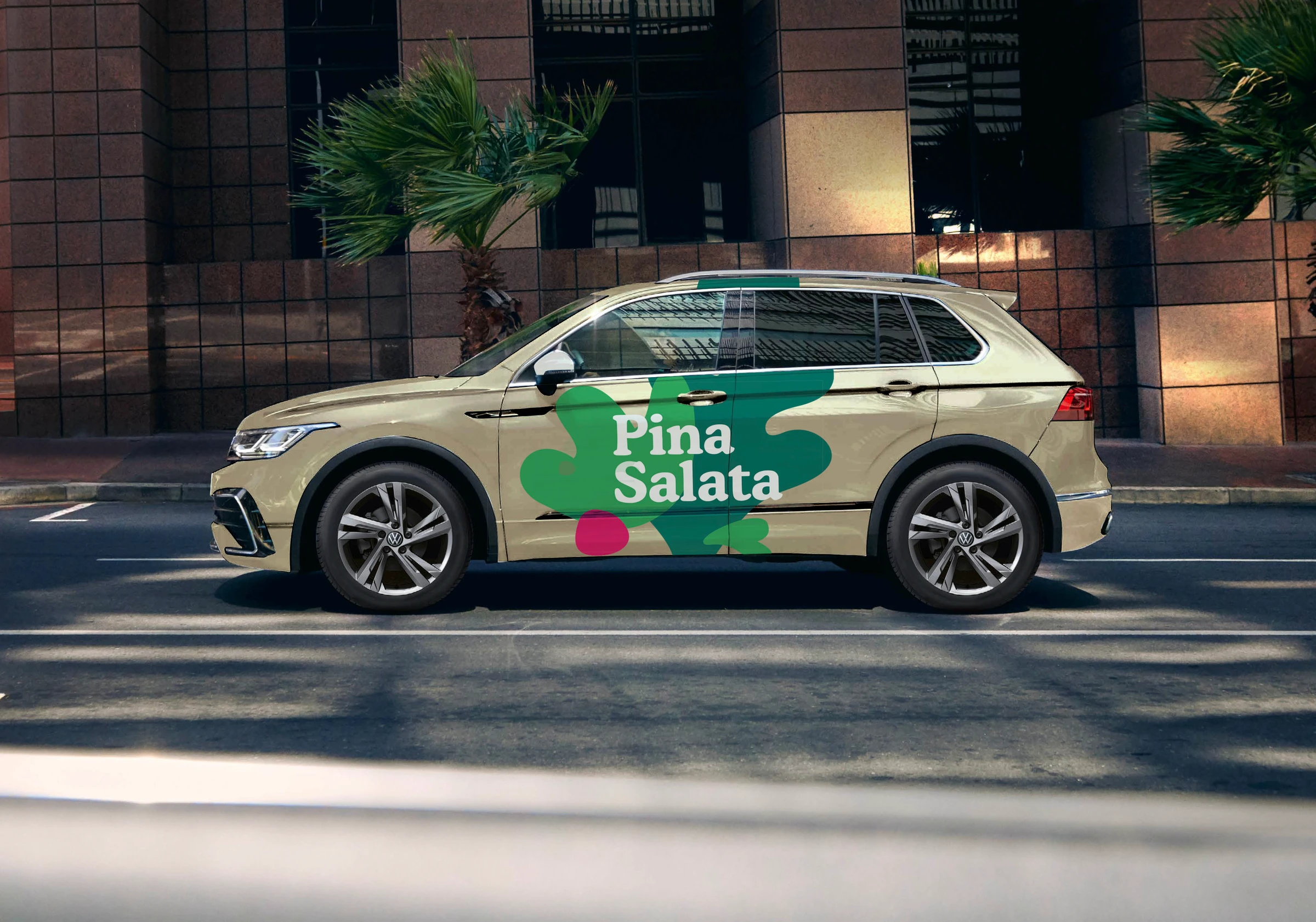
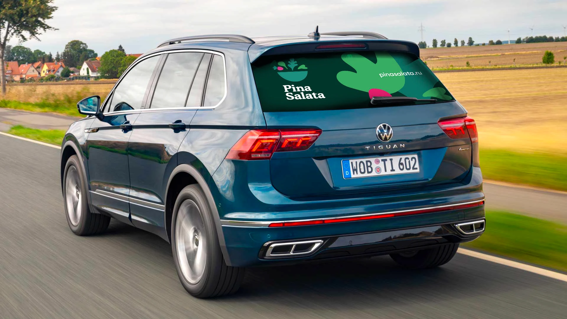
Vehicle studies carry the same graphic language onto metal and glass. Large green forms connect the applications without repeating an identical layout.
One living idea.
A complete identity.
The serving bowl gives the idea its shape. The ingredients give it movement and colour. Together with the lettering, they form a connected identity for packaging, transport and communication.
Original 2022 identity artwork and presentation mockups. Motion is a new interpretation of the original vector logo for this case study.