
Find a shared foundation.
The category study explored national symbols, minimal forms, abbreviations, industry references and circular compositions. The recommendation was a circle: a way to express wholeness and unity.
A visual identity that brings a professional community together. Built around a simple idea: individual members, united by a common purpose.

APA represents a professional community of flavouring manufacturers. Its role includes supporting interaction between members and public authorities, and protecting the interests of the industry.
The identity needed to speak to manufacturers, public institutions, the media and other professional communities. The design question was how to express collective strength while remaining modern, open and welcoming.
The category study explored national symbols, minimal forms, abbreviations, industry references and circular compositions. The recommendation was a circle: a way to express wholeness and unity.
Competent, modern, welcoming and honest. These qualities set the direction for an organisation that represents its members and connects them with public authorities.
The sunflower offered a clear image of an association: many individual elements gathered into one head, directed towards better conditions for the community.
Petal-like forms and the Cyrillic initials АПА become one circular signature. The same elements then extend into patterns, stationery and event materials.
The sunflower became the creative bridge between the association’s purpose and its visual identity.
In the project’s metaphor, many seeds form one head. For APA, that meant many members coming together around a shared direction.
The logo grew from the head of a sunflower: many individual seeds gathered into one whole. That became our metaphor for APA — independent members united around a shared purpose.
Many seeds. One head. A natural image of individuals belonging to a larger whole.
Petals form a circle. The Cyrillic initials АПА become part of that same circle, connecting the metaphor directly to the association.
The drawn idea is refined into a clear symbol. The circular structure and the relationship between petals and letters remain.
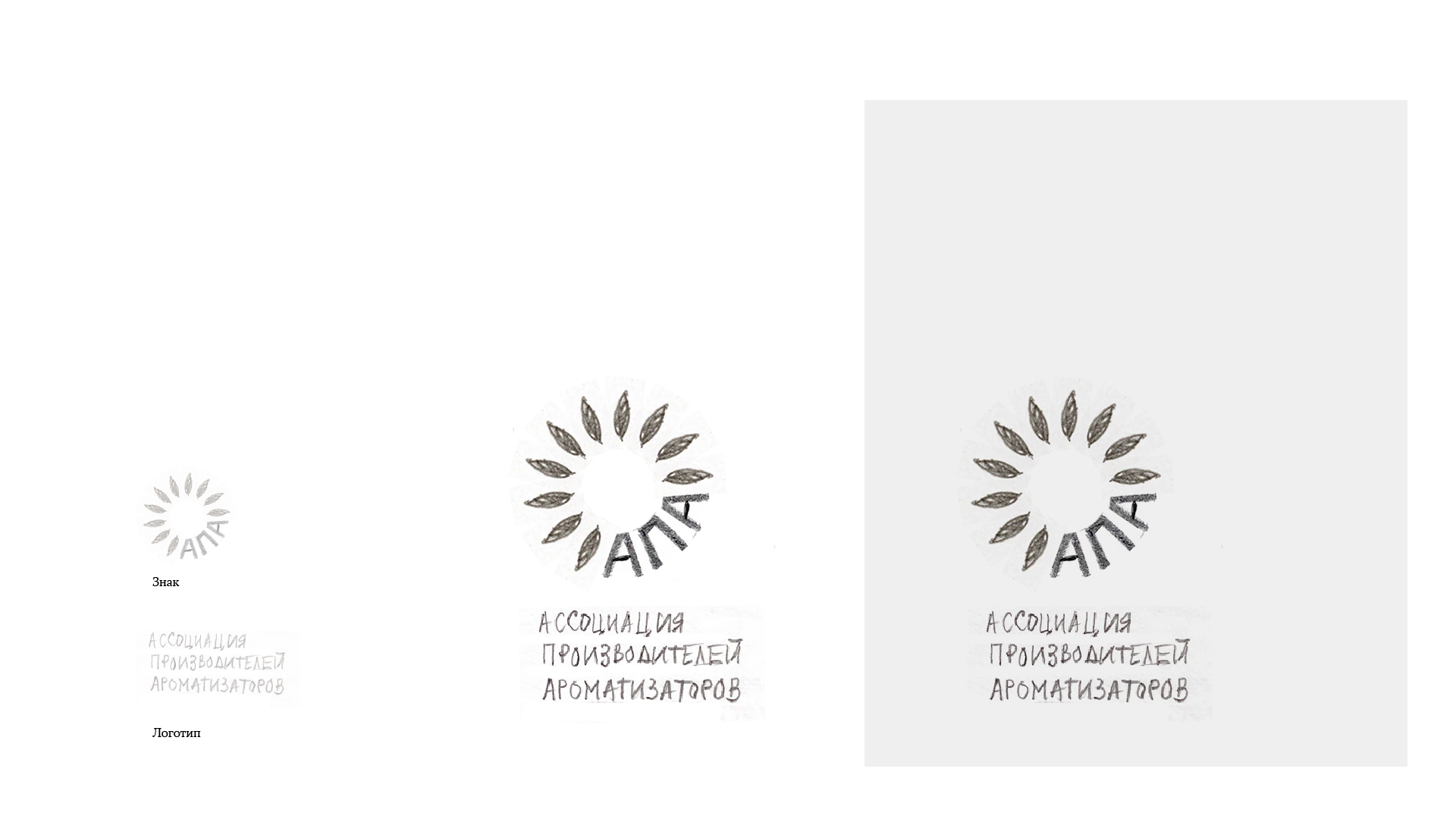
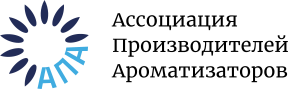
The same idea, refined: petals and initials united in one circle.
The process also explored round-table, ring and monogram concepts. Shown here as alternative directions, they help explain the choices behind the sunflower identity.
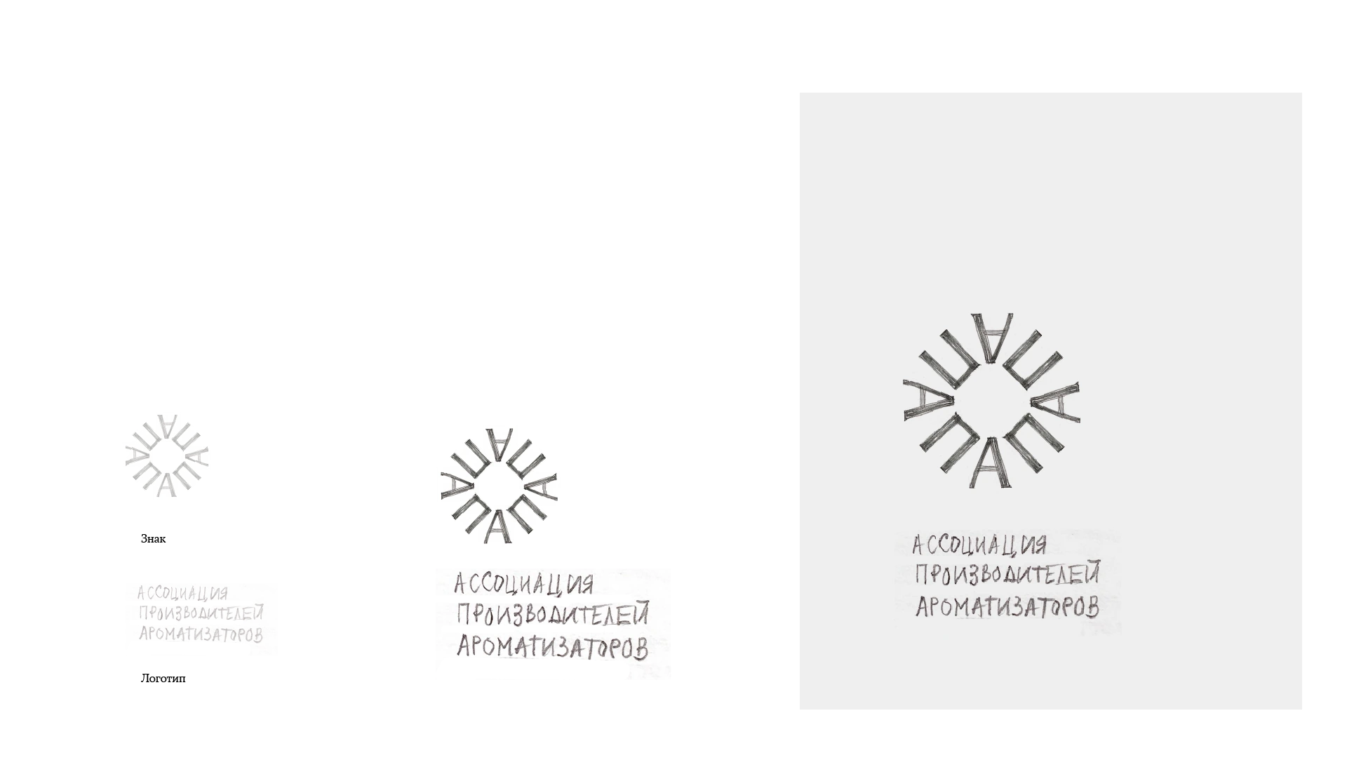
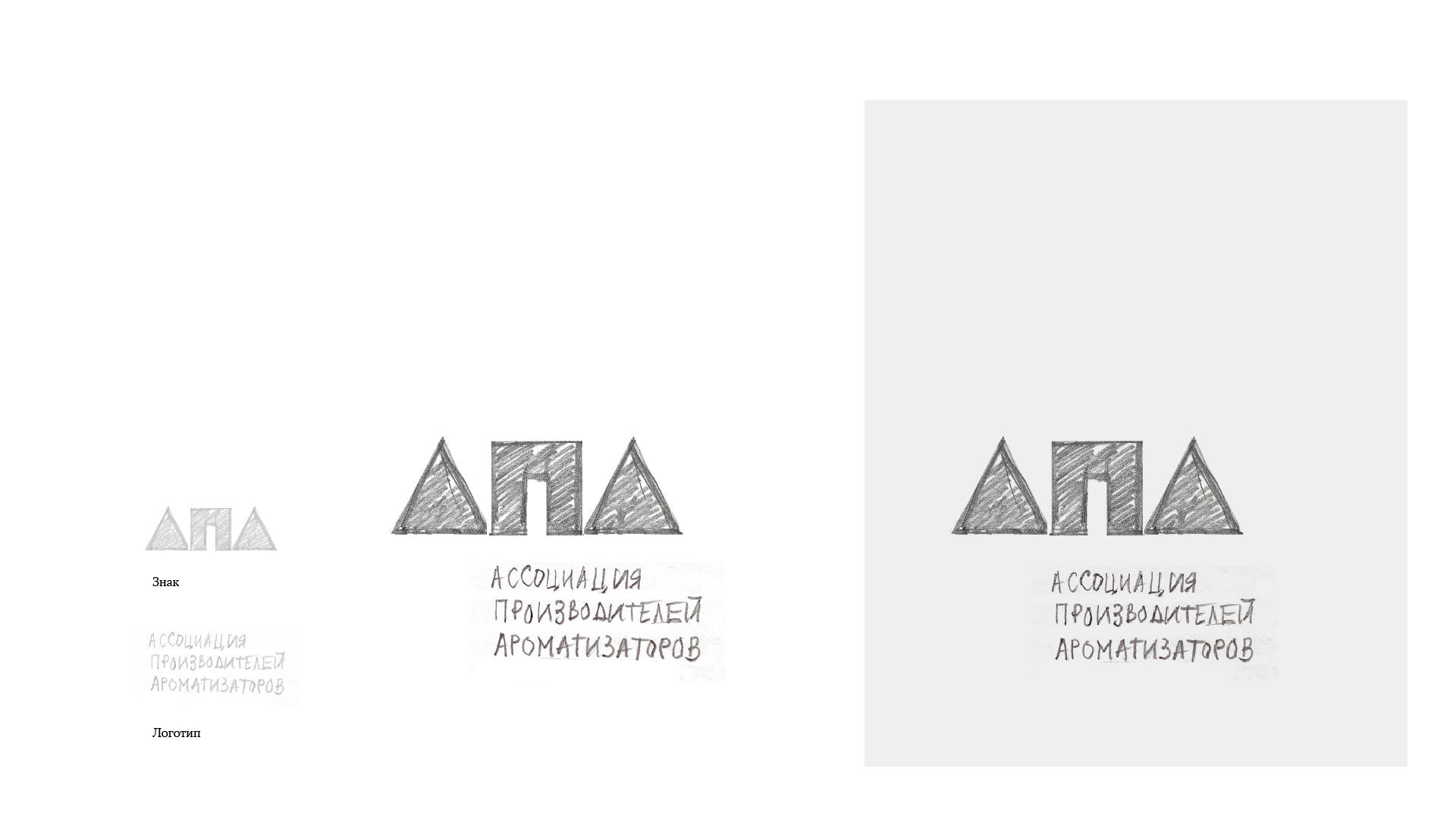
These are the original project sketches, including their Russian annotations.
The developed symbol combines petal-like forms with АПА, the association’s Cyrillic initials. Deep blue and light blue give the final identity a consistent signature, while a serif name adds a formal counterpoint to the organic mark.
Association of Flavouring Manufacturers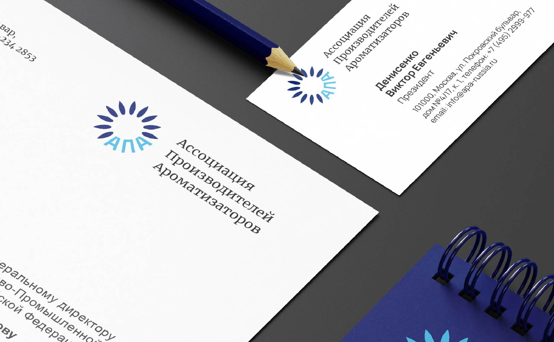

The petal form becomes a repeatable graphic element. Across stationery and event materials, its rhythm connects the individual applications back to the original symbol.
The result is a family of materials with a common visual character: letterheads, business cards, folders, notebooks, envelopes and exhibition graphics.
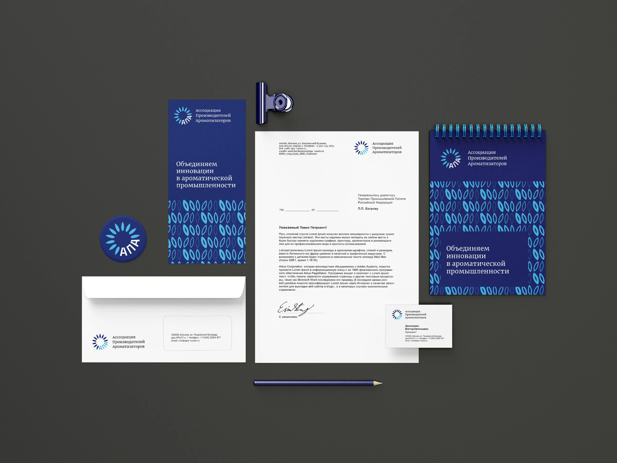
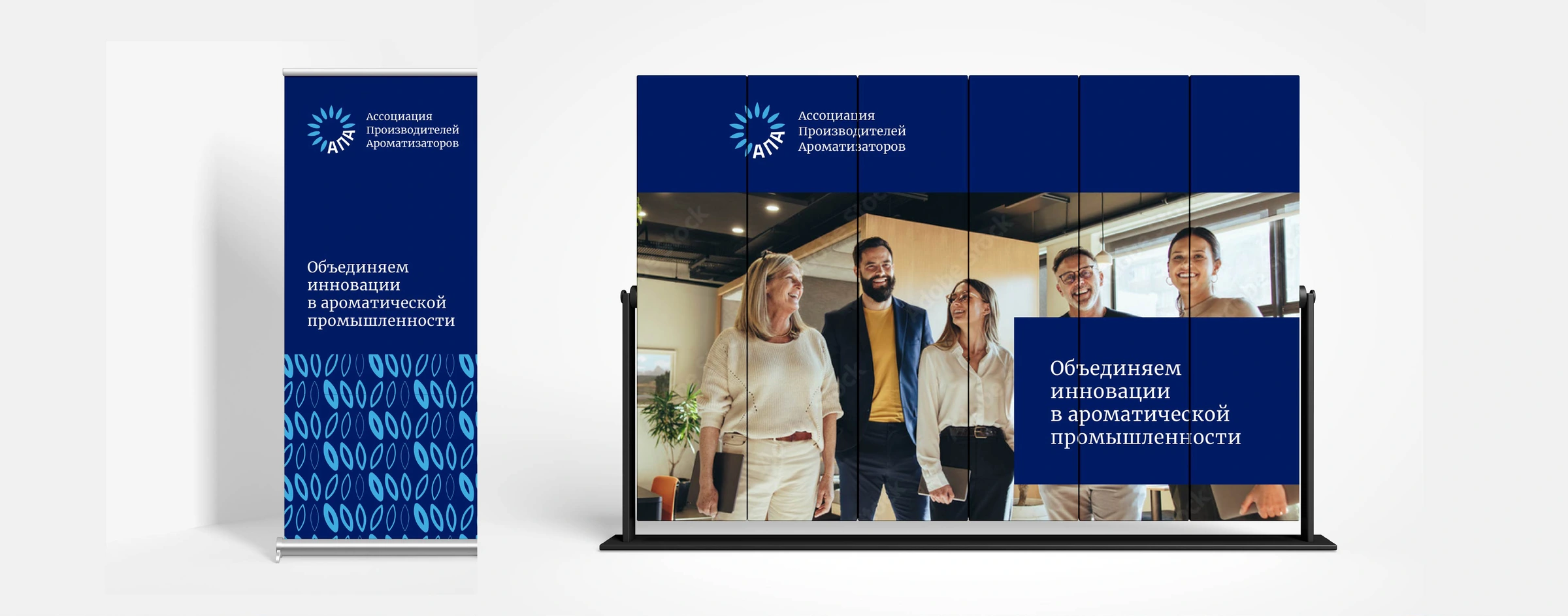
Research suggested unity. Strategy defined an open, professional character. The sunflower metaphor gave that character a form. The symbol then supplied the elements for a wider visual system.
This is how our in-house method connects what a brand stands for with how it looks.
Explore our approachOriginal project materials from 2022. The case narrative is presented in English; the original Russian identity and application artwork are preserved.