
Match the background.
Use the simpler graphic mark where the background is busy. Let photographic detail stand out on a plain surface.
A flexible identity for a container-farming concept. Bringing the freshness of growing food and the structure of a container into one recognisable mark.
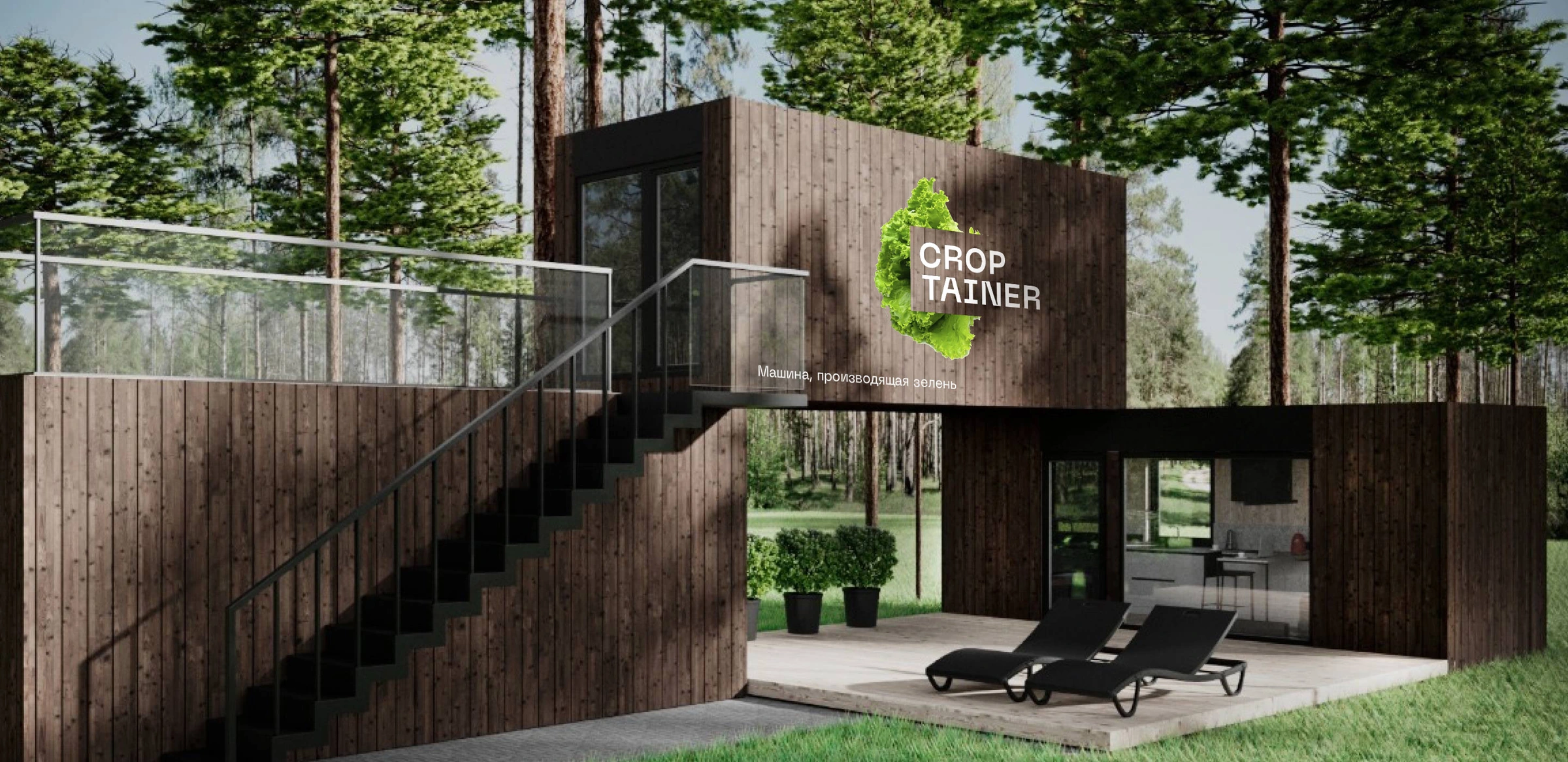
The brief described compact, mobile farms designed to grow greens, berries and vegetables close to the people who consume them. A growing system housed in a container.
The identity had to connect two different worlds: the natural appeal of fresh produce and the practical structure of farming technology. The name already contained that connection.
The leaf or berry makes the product tangible.
The framed wordmark gives it a stable home.
The identity translates the product concept into a visual relationship: an organic crop form paired with a compact, structured wordmark.
The original sketch sheets explore leaves, circular emblems, boxes and different arrangements of the name. They show the search for a relationship between what grows and the structure it grows in.
The final identity brings the two ideas together without enclosing the crop: an expressive organic form sits behind a compact wordmark.
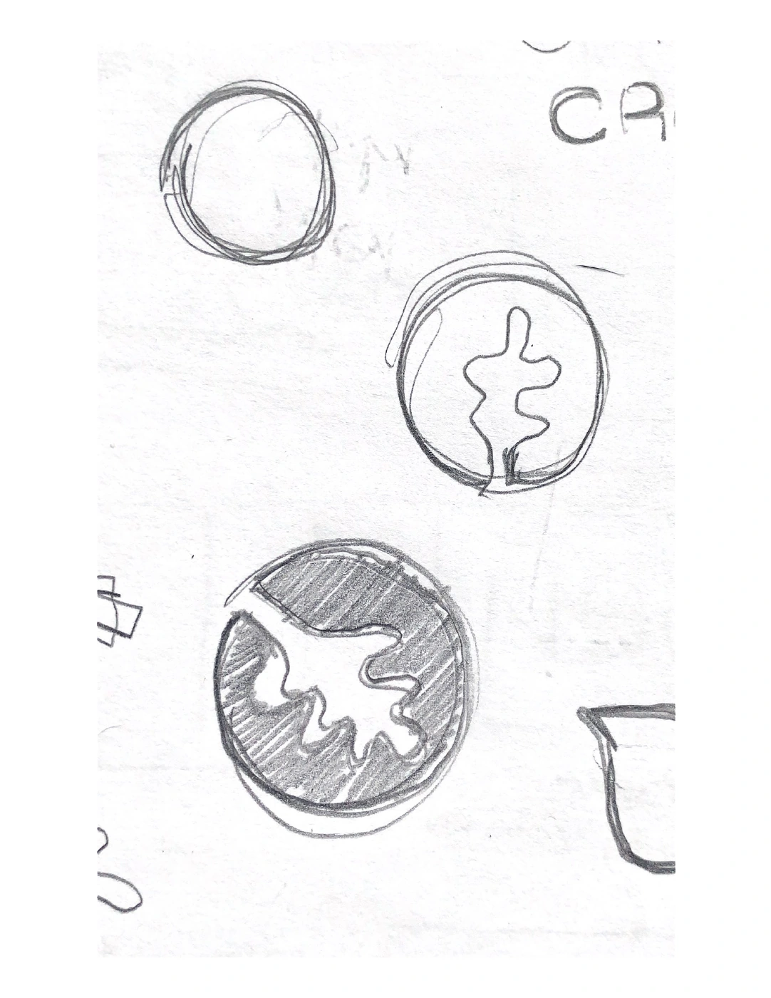
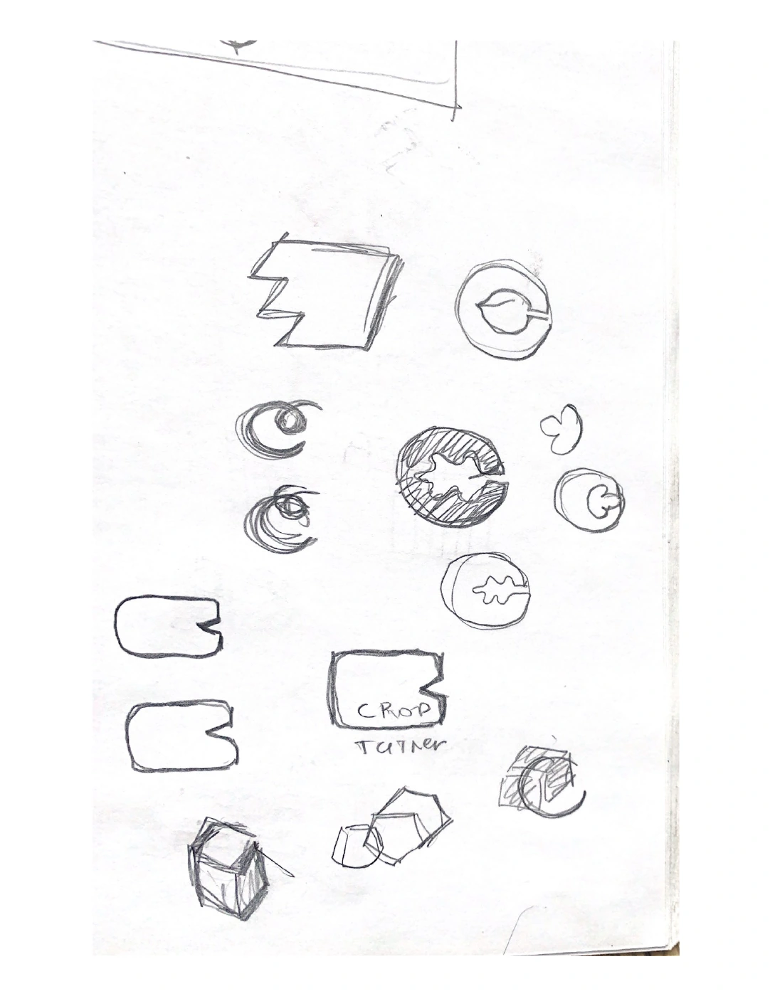
Exploratory drawings from the project archive. These are original working sketches, not reconstructions of the finished logo.
The crop can change. The container holds the identity together. The guidelines define graphic and photographic versions, selected to suit the background and the communication.
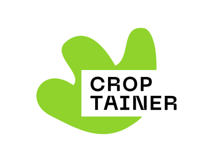 Leaf / Graphic expression
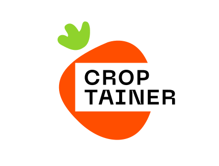 Berry / Graphic expression
Use the simpler graphic mark where the background is busy. Let photographic detail stand out on a plain surface.
Keep one logo expression within a layout. If a second mark is needed, the guidelines call for a monochrome version.
Clear space is measured using the height of the wordmark’s container, keeping the identity legible and distinct.
The guidelines pair Green Apple with Dark Pine, supported by sea tones, orange and Burnt Sugar. Neue Machina Semibold brings a distinctive technical character; Manrope supports everyday communication and serves as the specified alternative.
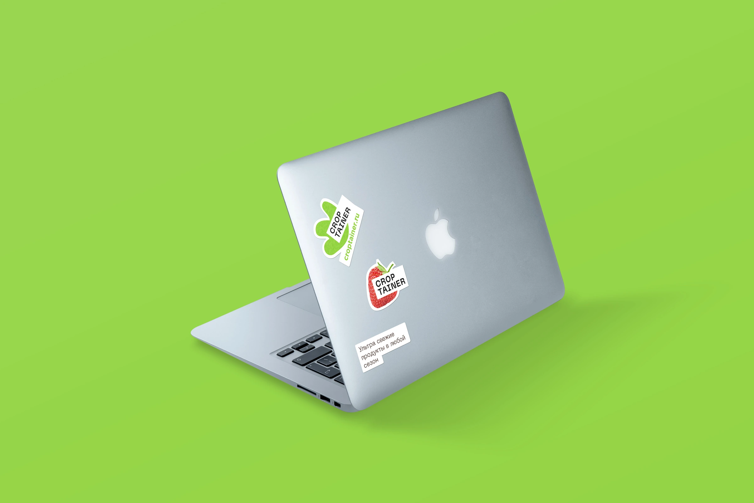
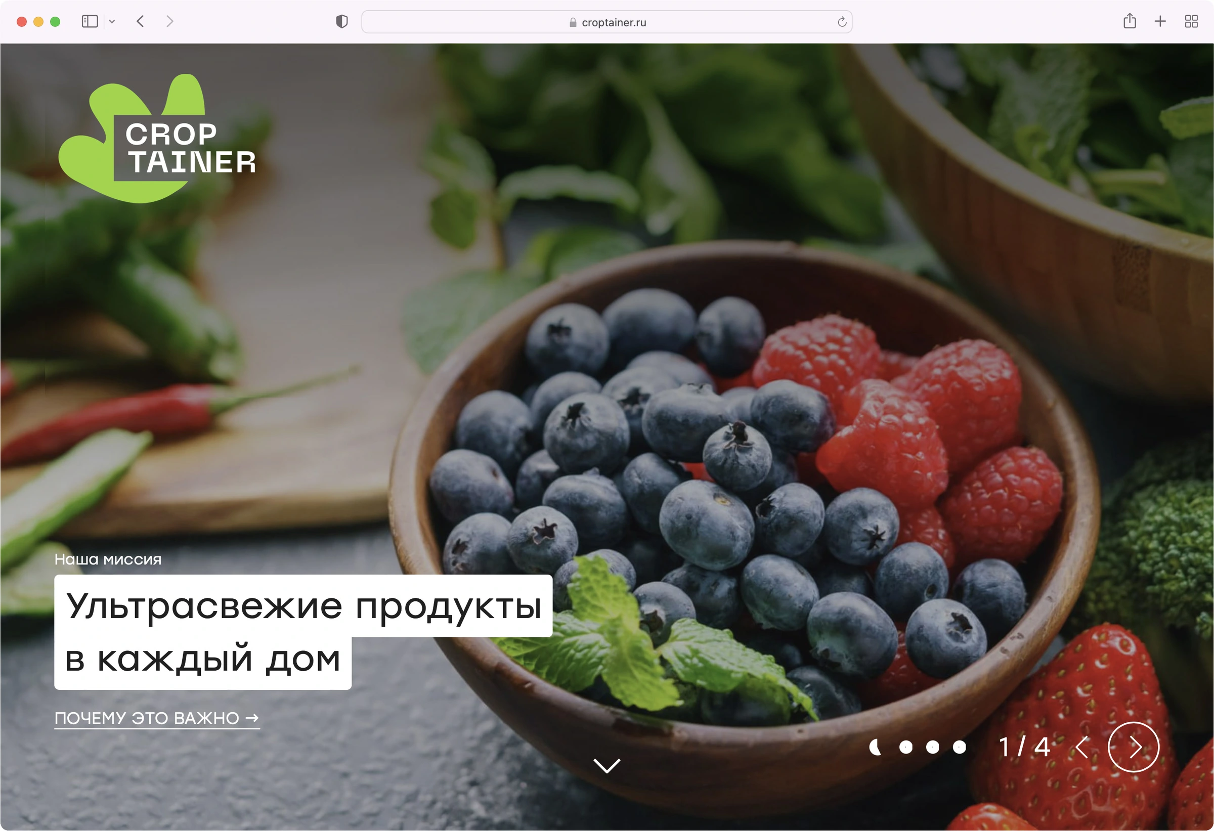
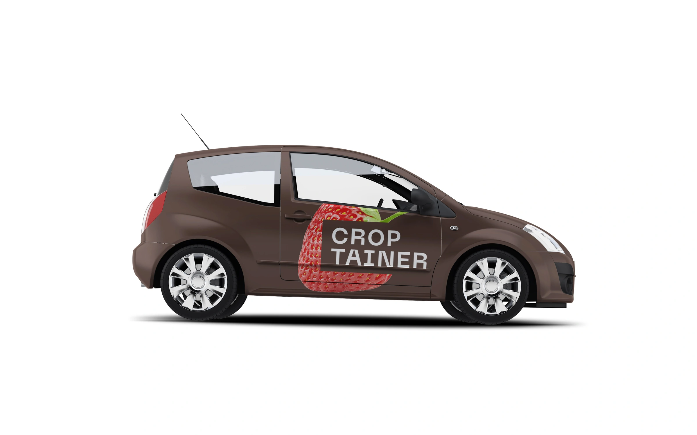
The system moves between product, place and communication. A large photographic leaf makes the container recognisable; simpler graphic marks keep digital and printed layouts clear.
The original applications explore this flexibility across a website concept, vehicle graphics, outdoor communication and stickers.
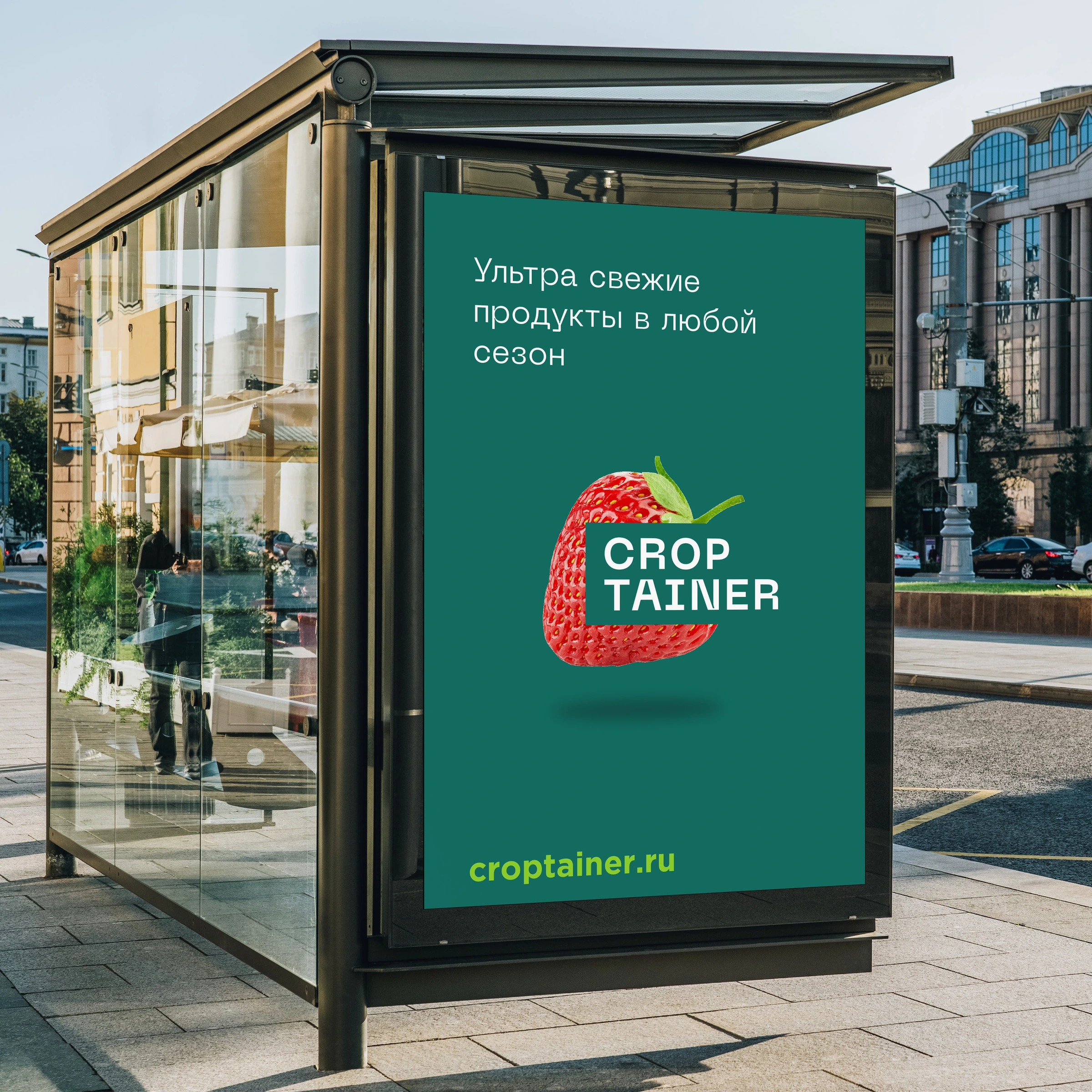
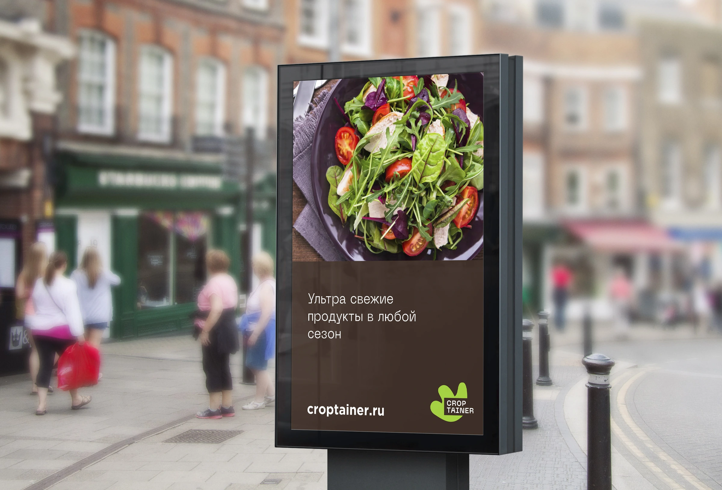
Understanding the product revealed the central relationship: crop and container. Sketches explored ways to express it. The final symbol established a structure, and the guidelines made that structure flexible enough for different crops and contexts.
The result is a connected identity system whose visual choices can be traced back to the original idea.
Explore our approachOriginal design work and application concepts from 2022. The English narrative preserves the original artwork, including Russian copy in some applications. Mockups illustrate design proposals, not a claim of deployment.