
A clear idea
before a visual answer.
Household care is a practical category. The challenge was to give that everyday function a warmer personality: peaceful, friendly and at home in people’s lives.
Turning a caring brand idea into an approachable identity for everyday household products.
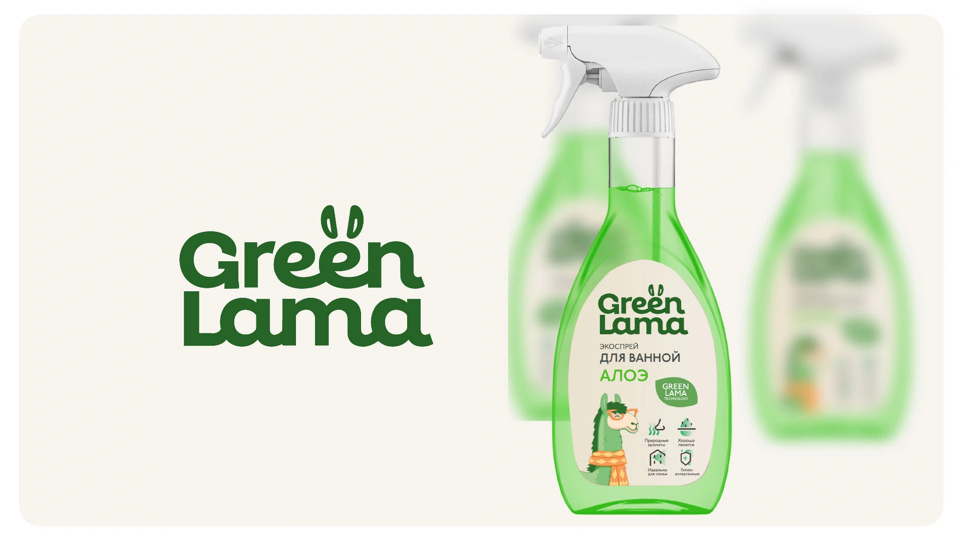
Household care is a practical category. The challenge was to give that everyday function a warmer personality: peaceful, friendly and at home in people’s lives.
The strategic metaphor was a “green heart”: care for the people closest to us. It described how the brand should feel, rather than prescribing a heart-shaped logo.
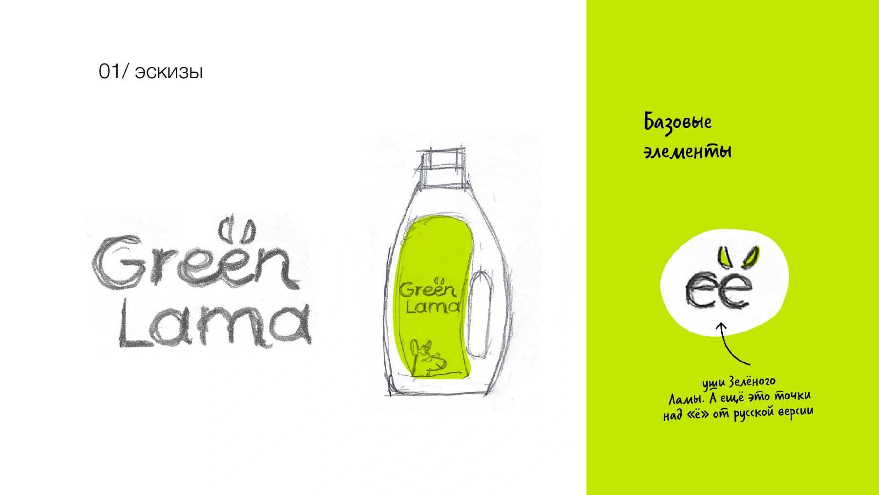
The drawings explore how the name could carry the personality itself. Llama ears above the lettering introduce the animal without turning the wordmark into a complicated illustration. The pencil bottle study tests that idea on a real packaging shape.
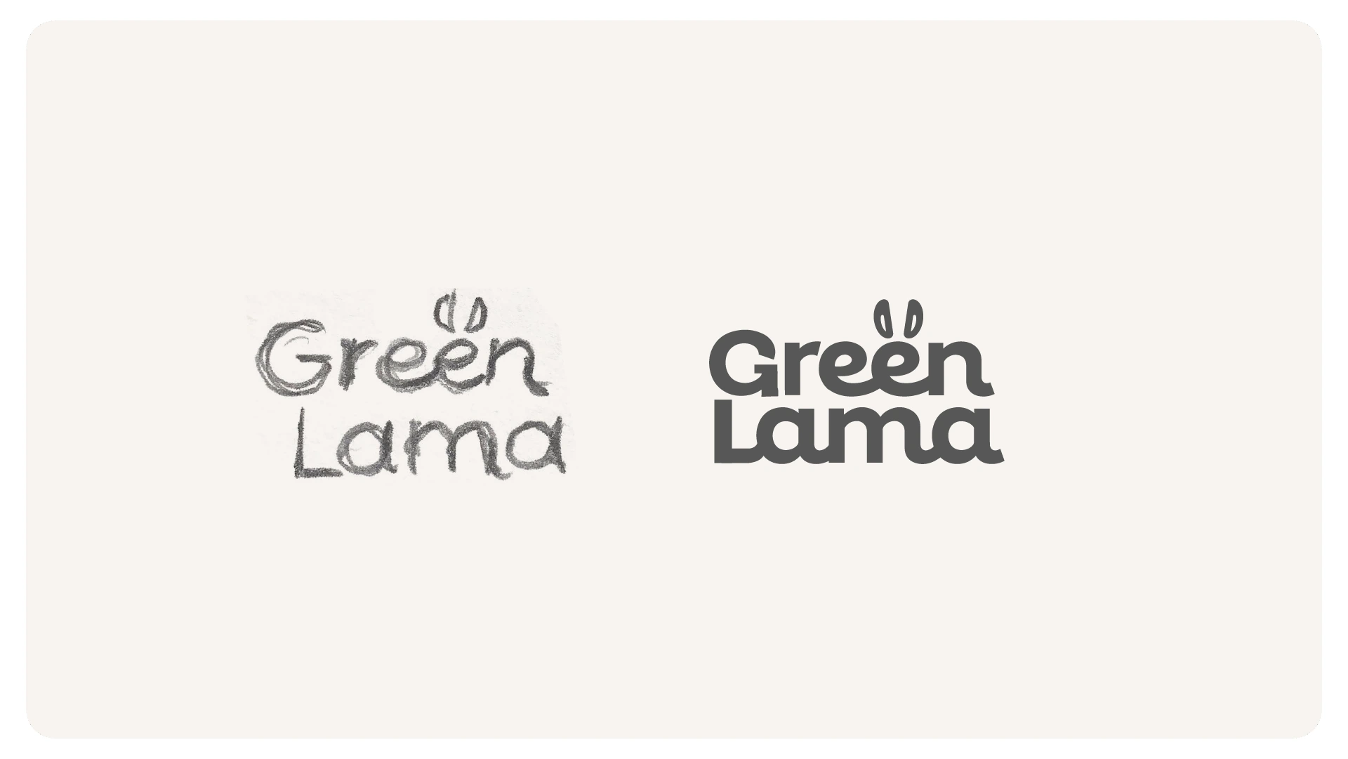
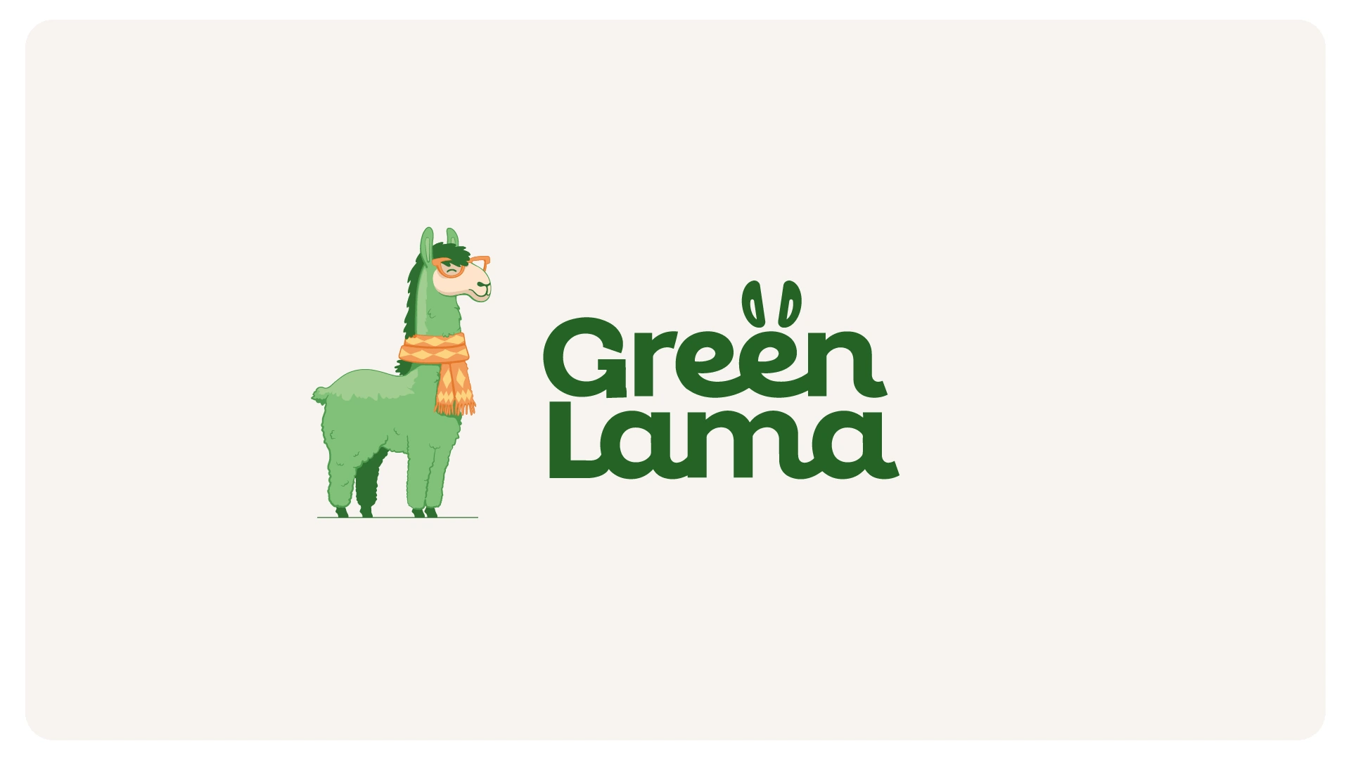
The wordmark was refined through changes to the letterforms, including r, G and L. Alongside it, a llama character brings another level of warmth. The same central idea can work quietly in the lettering or more expressively in illustration.
Original application studies show how the identity works across different scales, materials and situations.
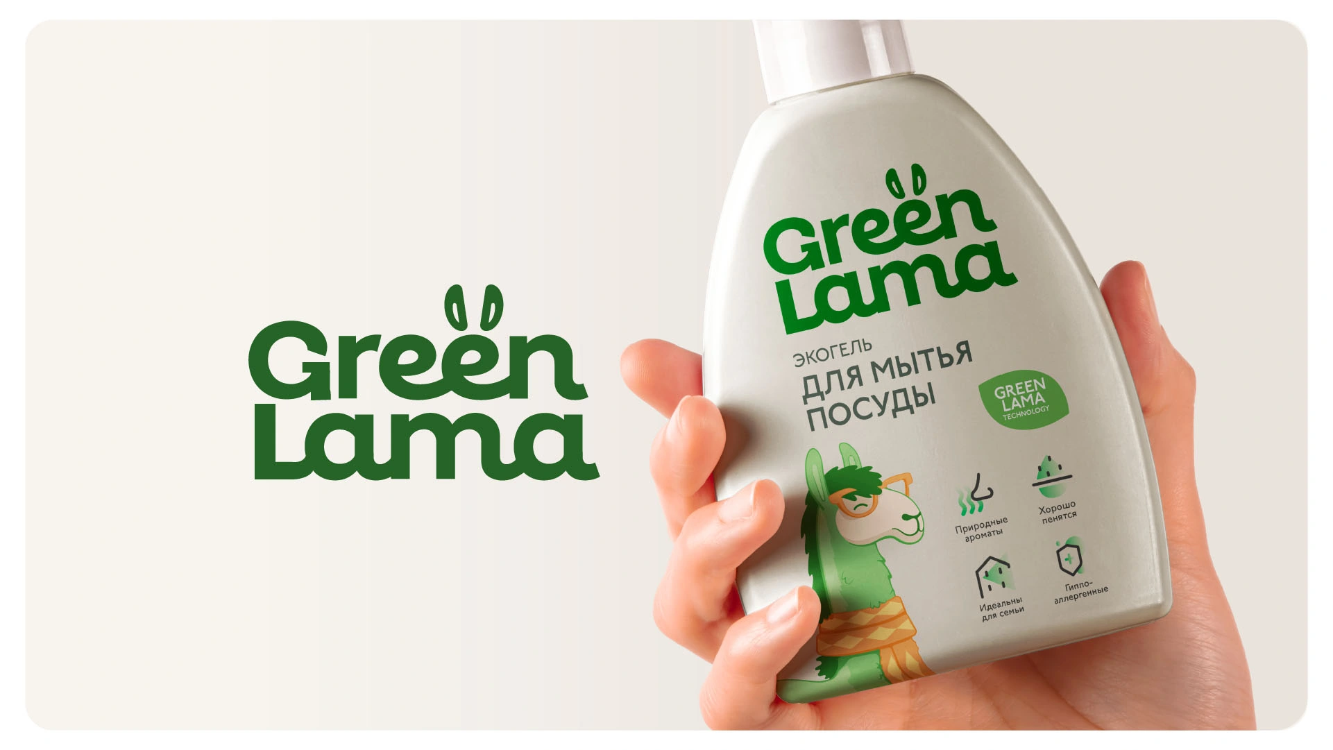
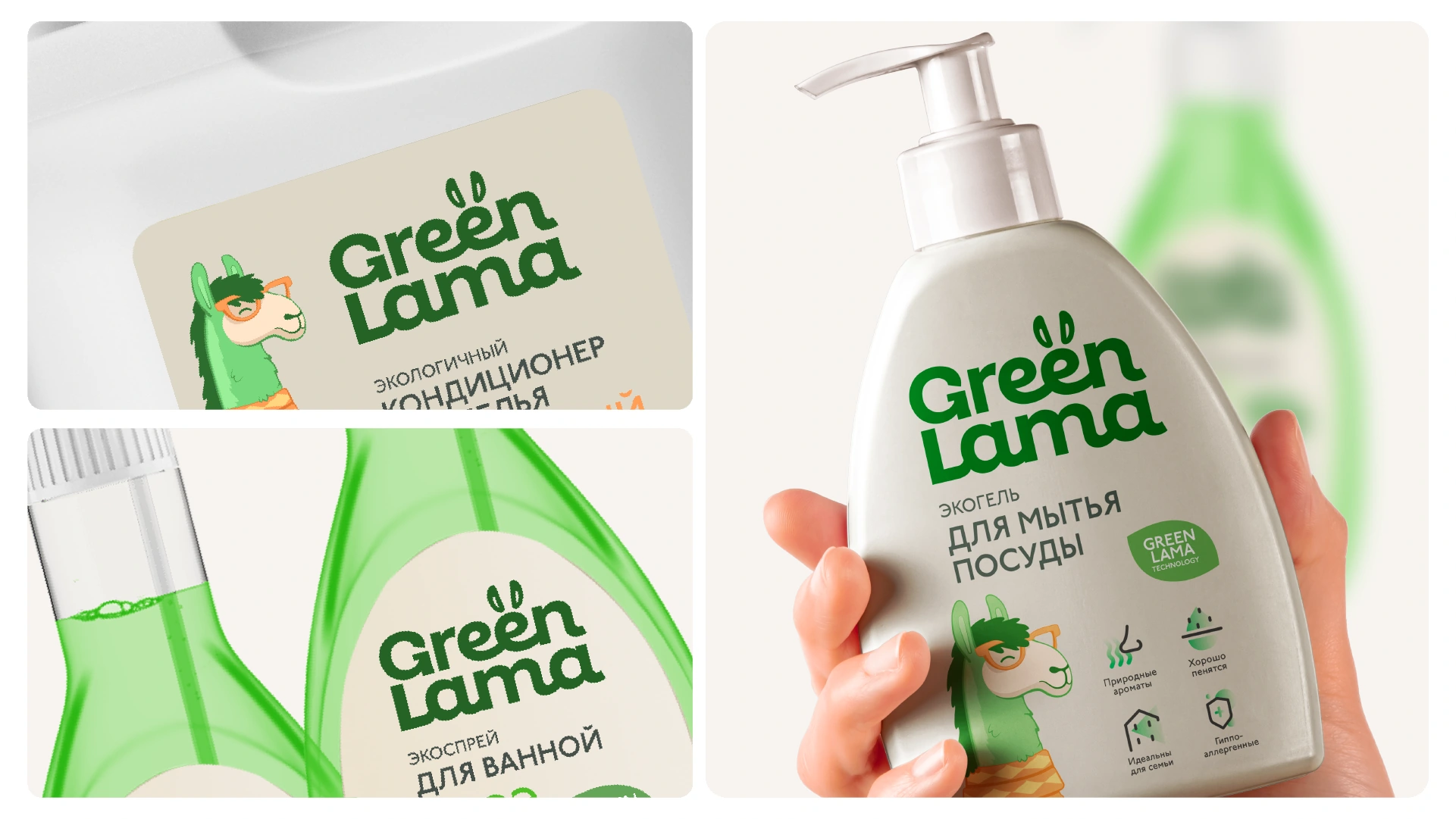
Research established a caring personality. The metaphor made that personality tangible. Sketching translated it into ears, lettering and a character, and packaging studies tested how those decisions could work together.
Explore our approachResearch began in 2022; the logo and packaging studies shown here come from the 2023 continuation. Packaging images are design explorations, not a claim of a completed product launch.