
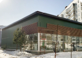
АРЕНДА · НОВОСИБИРСК
ТЦ «Лазурный»
Пространство для вашего бизнеса
Подробнее об объекте ↗An identity concept for a commercial property developer. An ambitious, energetic character becomes a flexible system of warm colour and adaptable proportions — from the signature to the everyday objects around it.
Otelit develops commercial property. The brief asked for a distinctive brand character that could communicate the developer’s ambitions and support the way it presents itself to investors.
The research and strategy work led to a sporting-character metaphor: an ambitious, dynamic team working towards a goal. The concept translates that idea into layered warm-colour blocks and a signature that adapts to different surfaces.
Warm, overlapping colour blocks express growth. The logo adapts to its surface: a compact horizontal signature or an extended vertical form that becomes part of the graphics.
The website brings property search, catalogue browsing and enquiries into one clear journey. The updated concept carries the new logo, warm palette and layered graphics into desktop and mobile layouts.
The original designs are preserved alongside the update. Switch between the two to compare the earlier identity with the new digital direction. The update is a design concept, not a launched website.

Помещения, в которых ваш бизнес
сделает следующий шаг.
Пространство для вашего бизнеса
Подробнее об объекте ↗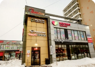
Пространство для вашего бизнеса
Подробнее об объекте ↗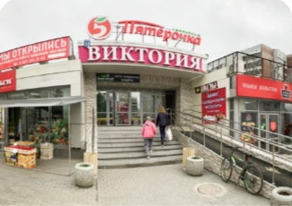
Пространство для вашего бизнеса
Подробнее об объекте ↗Новосибирск, ул. Высоцкого, 45/1
Торговые площади в жилом районе. Удобный подъезд и отдельный вход.
A new design study based on the archived layouts. The warm palette, adaptable logo and layered graphics carry the identity into property search and enquiries. Concept only.
A compact signature and an extended graphic expression belong to the same flexible identity. The logo changes its proportions with the surface while retaining its character. All application images are original concept mockups.
Explore our approach