
One project.
A connected idea.
Listva was created for a contemporary flower salon in Kemerovo. The owner’s focus on fresh flowers, honest service and modern bouquets informed the brief.
The project connected a natural name with a botanical identity and a practical set of usage rules. Each discipline is explored in its own chapter.
Explore the work.

A fresh beginning.
The project brought together naming and identity for a flower salon in Kemerovo. Listva — Russian for “foliage” — became the starting point.
The name suggests greenery and freshness. Its visual expression grows from the same botanical language.
Foliage.
A simple word.
A world of natural forms.
Leaves, letters
and possibilities.
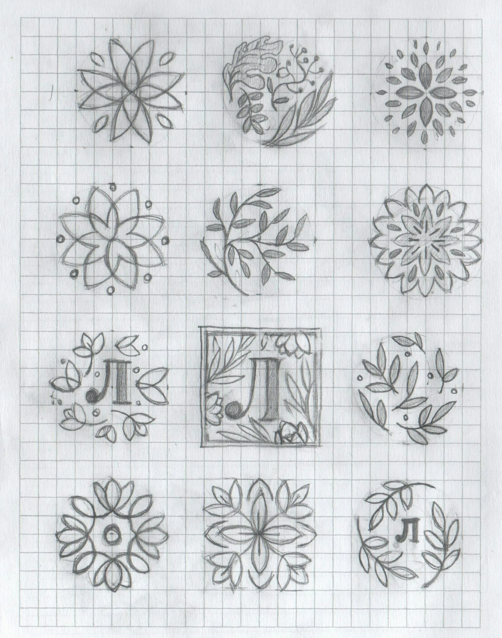
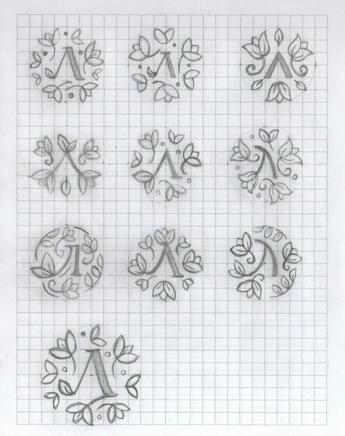
The original drawings explore a Cyrillic Л, leafy wreaths and different ways to bring the two together.
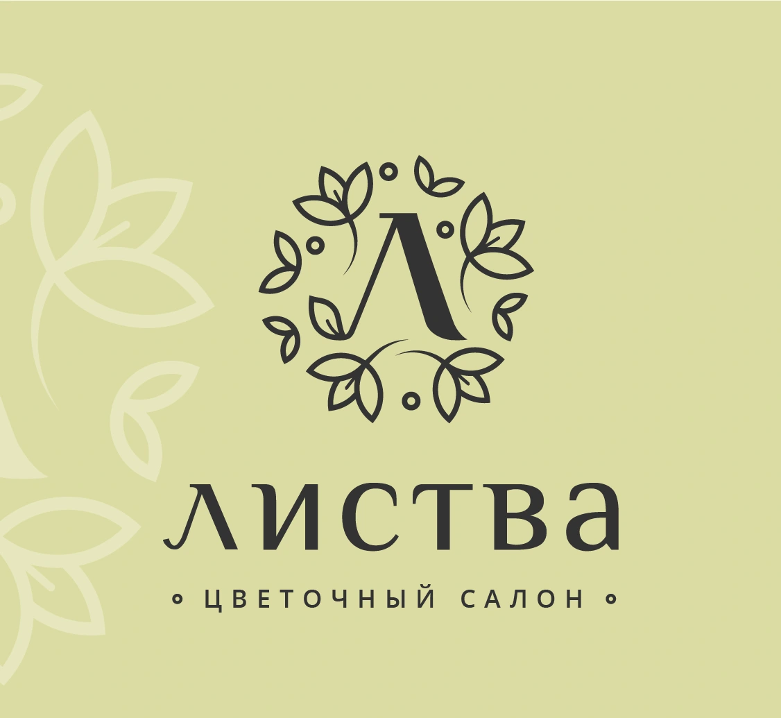
The selected mark frames the letter with a loose botanical circle. Individual leaves keep the outline varied and organic.

Rooted in
the name.
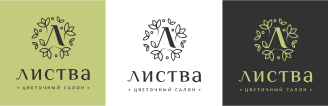
A leafy monogram, an expressive wordmark and a restrained green palette form the core identity.
A quiet presence.
A clear invitation.
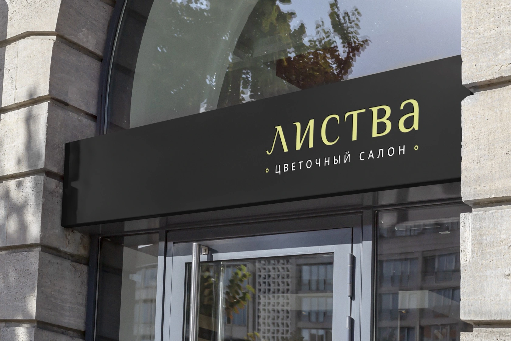
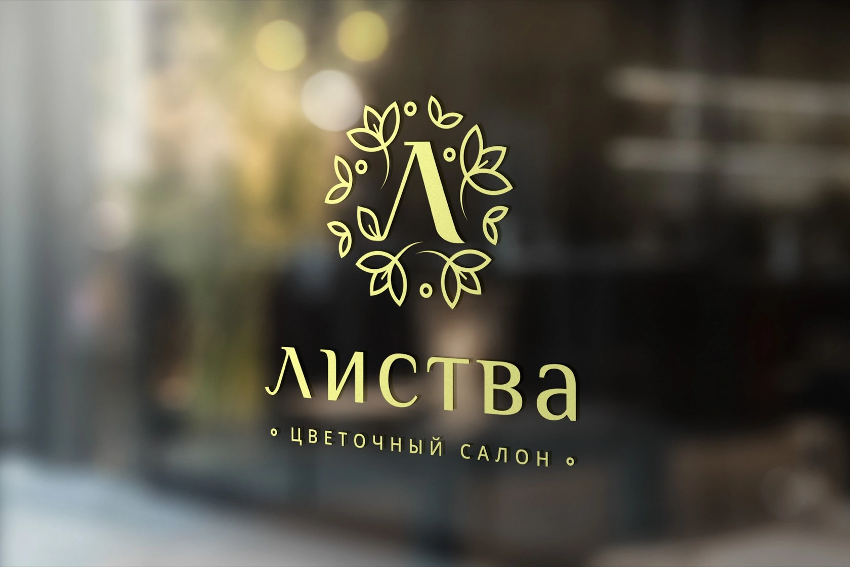
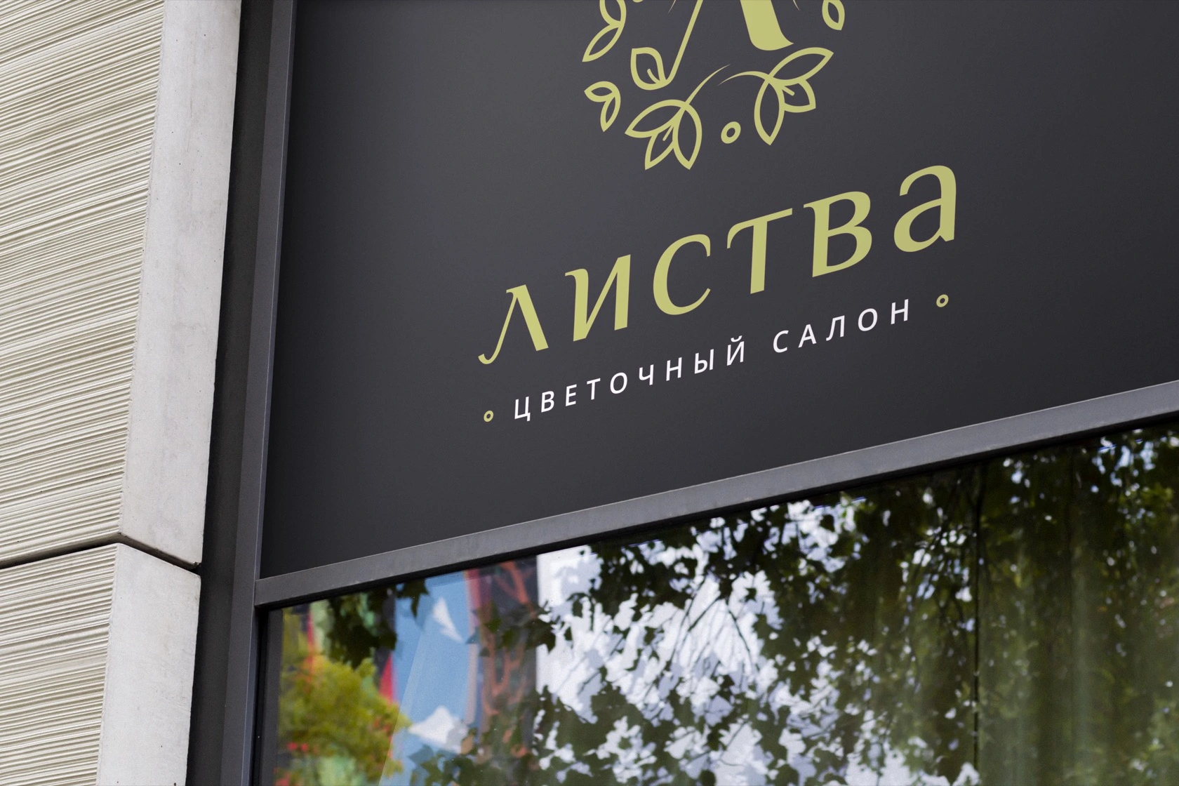
The identity moves from a projecting sign to a facade and window. Dark surfaces give the pale botanical mark room to stand out.
These original presentation mockups show the proposed applications.
A system for
consistent use.
The original guide brings together symbol and signature versions, colour values and typography. It gives suppliers and the salon team a shared reference.
Explore the guideline
From a sunflower
to a shared symbol.
Project archive · 2019. Original Cyrillic artwork is retained. Environmental images are original design presentation mockups.