
The pattern
A triangle is the basic element. Repeated in yellow and two greys, it carries the same flag idea across covers and communication.

A team becomes a symbol. An identity, corporate website and brandbook bring different businesses into one visual story.
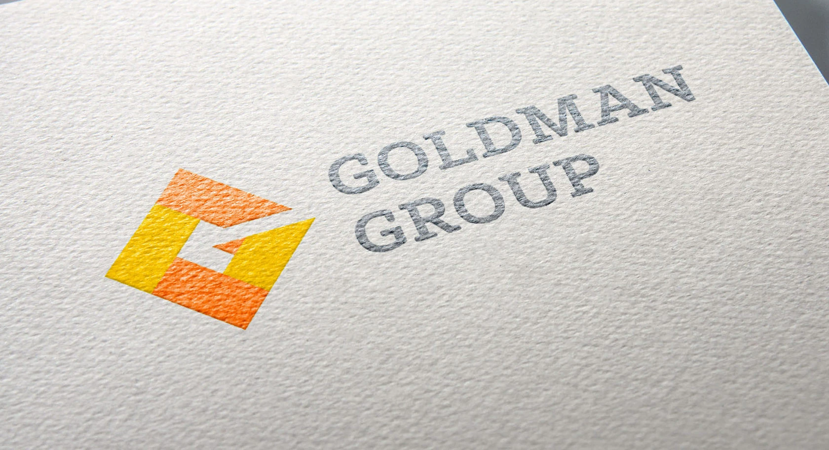
The original brief called for a logo and visual identity for a diversified Siberian holding, supported by a practical set of brand standards.
The organisation connected businesses across a production and supply chain. The identity needed a shared idea that could represent the group as a whole.
“Team” became the central metaphor. The letter G gives that idea a compact visual form: separate parts join to make one recognisable mark.
The original identity uses yellow as its main colour, associated in the studio’s concept with sunshine, wealth and fairness. Grey and orange support the signature.

The original pictograms use a shared line style and restrained yellow and grey palette. Agricultural machinery, wheat, grain and storage give the group’s activities a clear visual vocabulary.
The brandbook recommends using icons where photography is not suitable, particularly in presentations and infographics. Their composition, colours and supporting type belong to the same identity system.
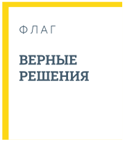
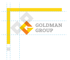
The flag is a recurring layout device. Its proportions and minimum distance from the signature are measured using an element of the logo.
The triangular pattern extends the same language into covers, documents and other materials. In the guide, the flag connects the system with speed, innovation and professionalism.
A triangle is the basic element. Repeated in yellow and two greys, it carries the same flag idea across covers and communication.
The yellow corner becomes a recurring layout device, connecting the signature, the headline and the space around them.
A shared line style and yellow accents connect the group’s activities. Icons support presentations and infographics where photography is not suitable.

The flag follows a consistent set of proportions.
An element of the logo provides the unit used to define those proportions.

A module taken from the mark defines the minimum clear space.
This is the minimum distance from the edge of the mark to the edge of the flag.

The logo element sets the flag’s proportions and the clear space around the signature.
The website was designed for investors, the press and public-sector audiences. A full-screen video introduction leads into the group’s activities, assets, financial information and news.
The studio’s documented work includes the concept, prototype, design, frontend layout, photography selection and content.
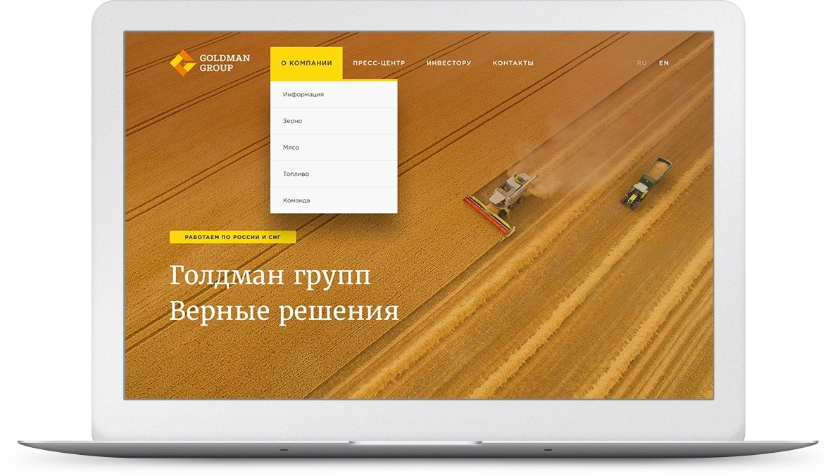
An original corporate website with moving imagery, a clear navigation structure and information for an investor audience.
Explore websiteThe brandbook documents the brand platform and the rules needed to apply the new identity consistently. It brings together the signature, typography, colour, graphic elements and practical applications.
Print and transport standards extend the system beyond a logo file, helping different materials speak in one visual language.
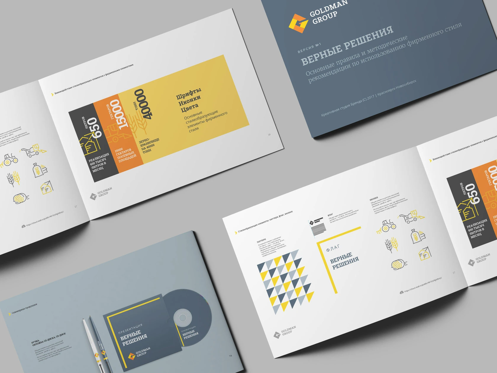
A practical guide to the signature, graphic language, corporate materials and transport.
Explore guidelinesThe team metaphor informs the mark. The corporate website presents the group’s story. The brandbook defines how the identity works across its materials.
Original project artwork and presentation mockups.