
Make the subject accessible.
The research and metaphor presentations explore how to make learning interesting and explain complex topics through stories.
A distinctive identity for the Novosibirsk House of Financial Education: helping a learning organisation communicate with confidence and clarity.
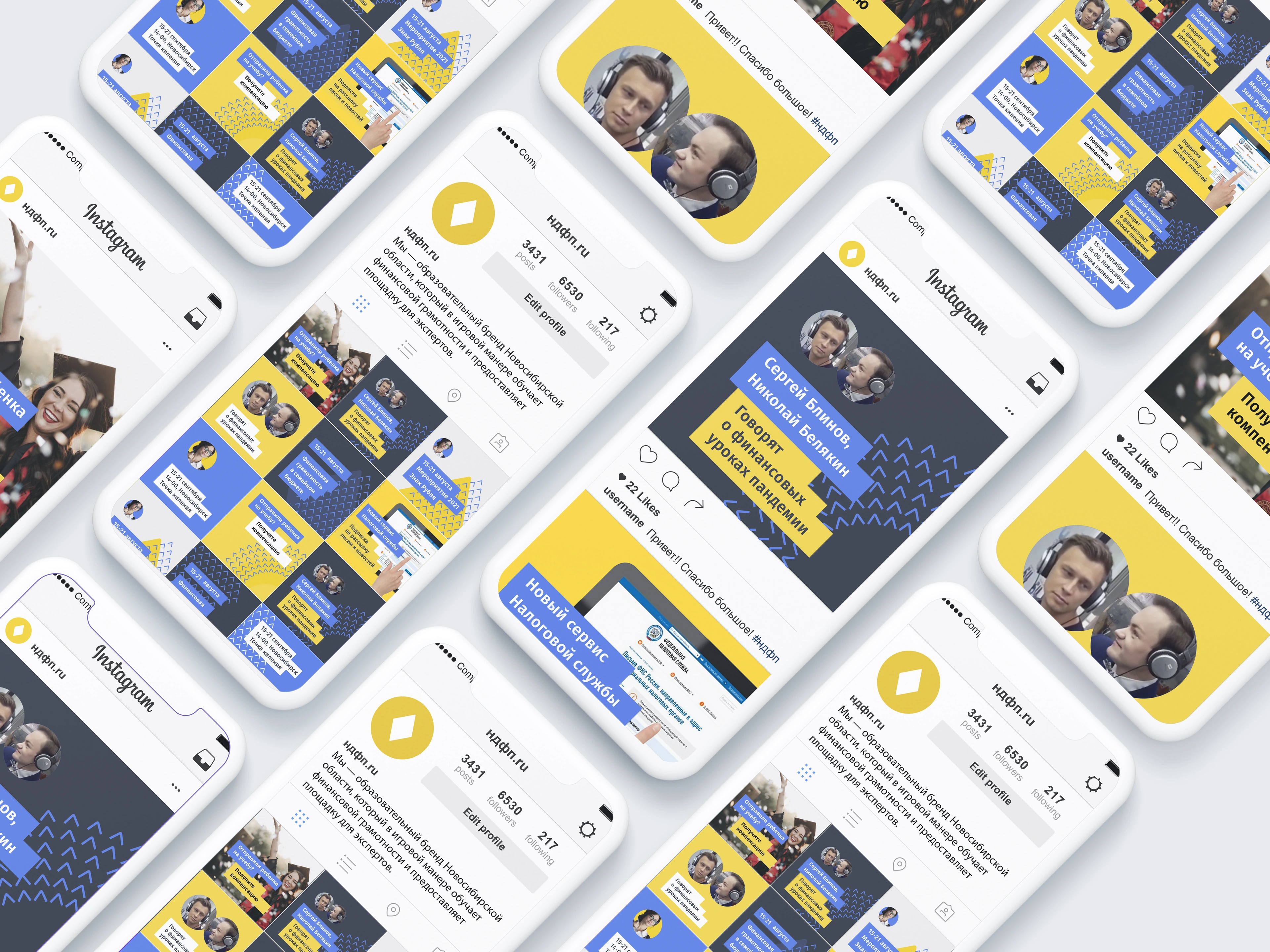
NDFP creates financial literacy projects for children and adults and brings experts together on one platform. Its identity needed to connect educational content, public events and everyday organisational materials.
The strategic work focused on making financial education understandable, engaging and convenient. A clear voice and a recognisable visual language could give different formats a common point of reference.
The research and metaphor presentations explore how to make learning interesting and explain complex topics through stories.
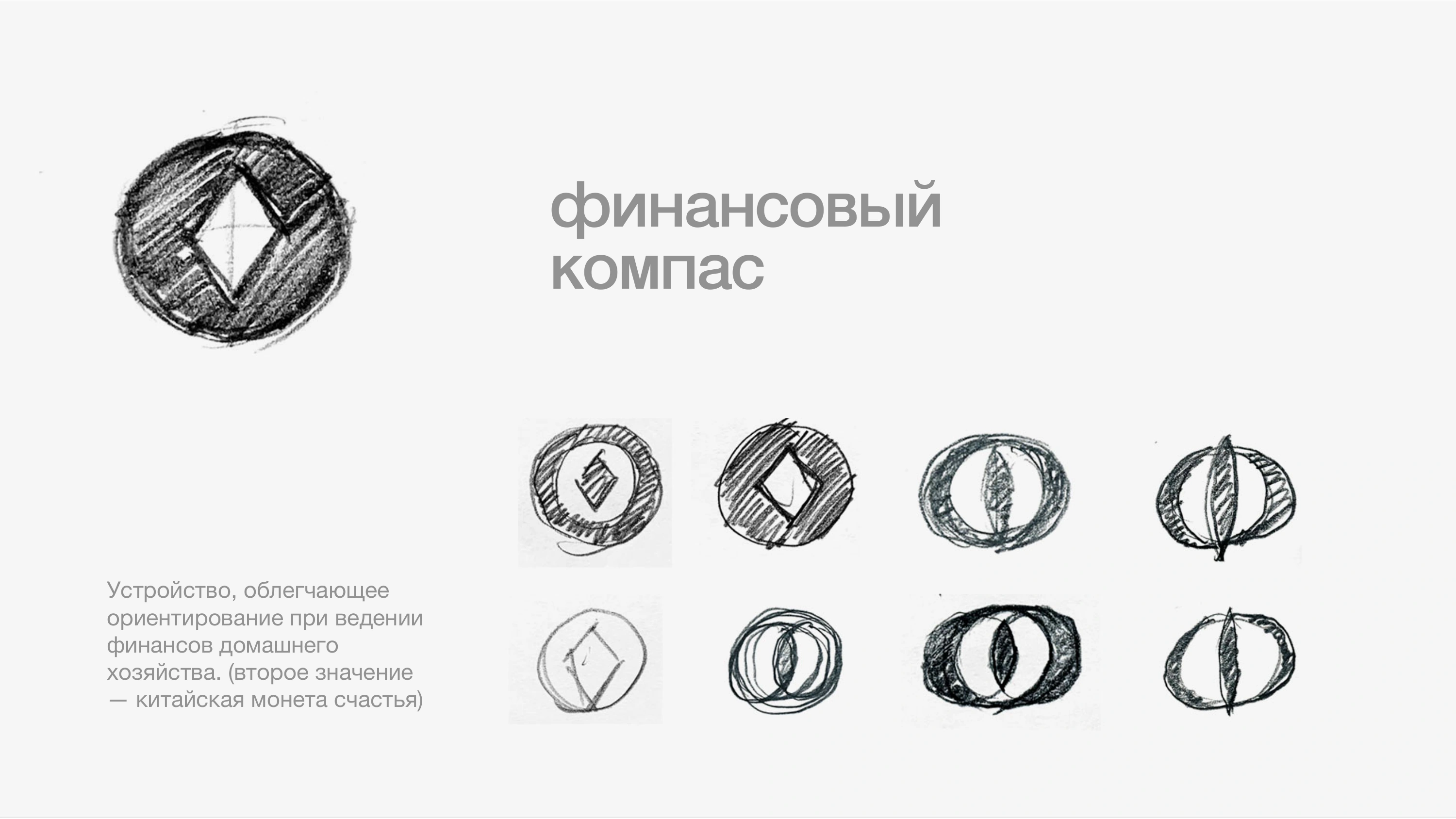
Original routes include a wallet of knowledge, a mentor, dialogue and a financial compass.
The selected compass becomes the signature. Its arrow carries the idea into a wider graphic system.
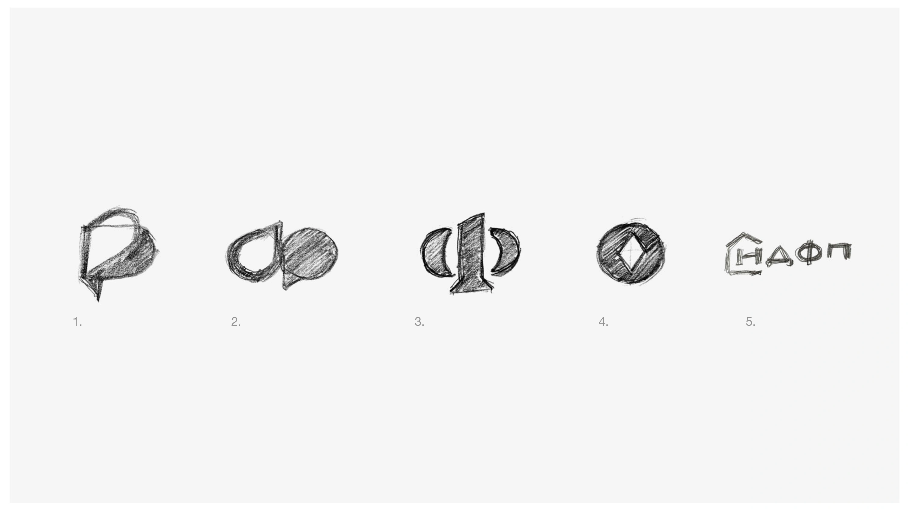
The sketches investigate ways to express financial knowledge through the Cyrillic letter Ф, conversation, guidance and a place to learn. The compass route brings knowledge and direction together.
The chosen symbol consists of a body and an arrow. The guide describes it as a reliable companion for navigating the world of finance.

A compact symbol of orientation.
A clear, direct signature.
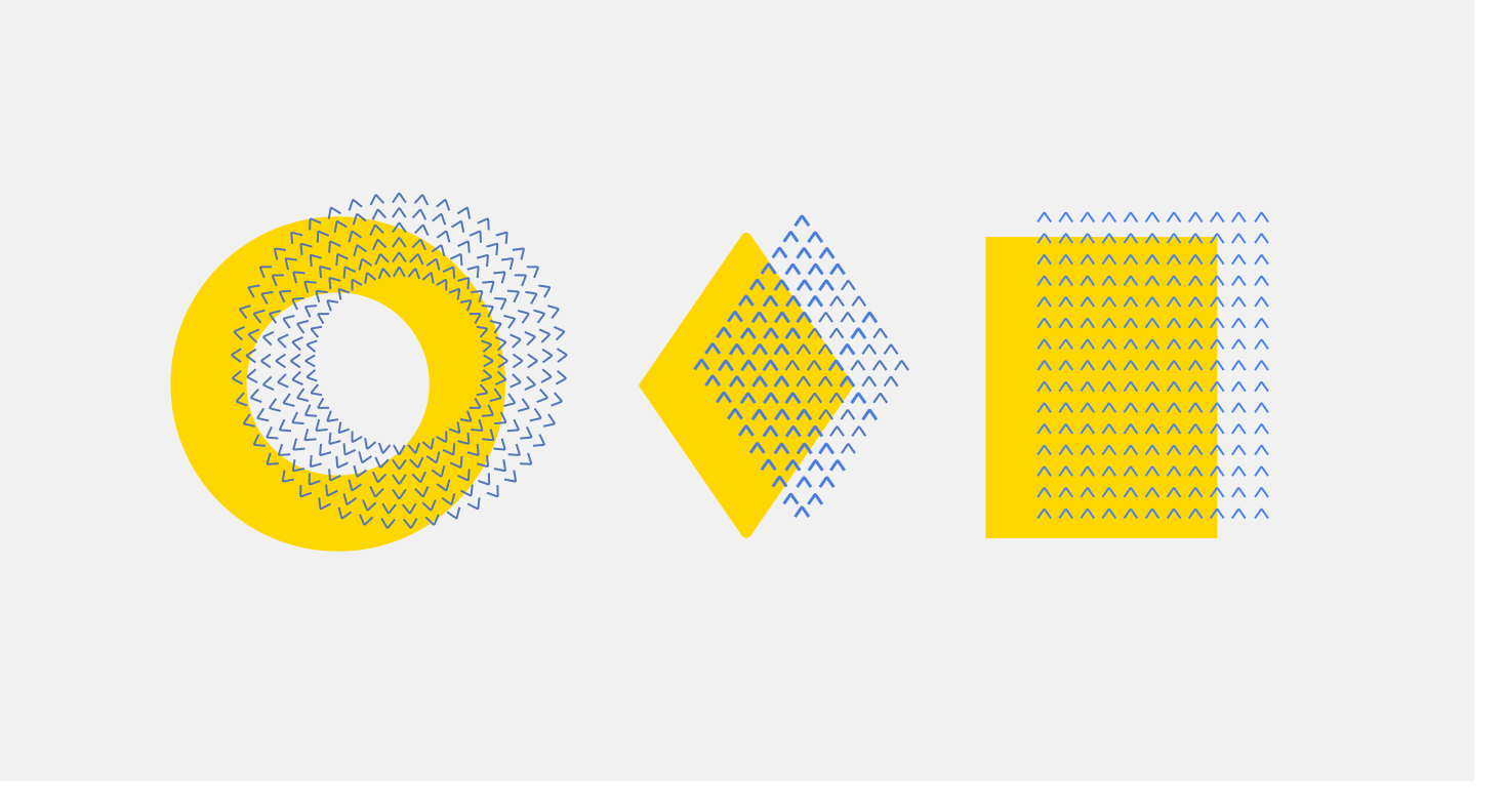
The arrow moves beyond the logo to become the identity’s key graphic element. Repeated and arranged, it forms a circle, a triangle or a square. Each composition gives the same small element a different meaning.
The circle suggests financial protection; the upward triangle expresses growth; the square brings individuals together as a community. This gives the system more than a decorative pattern: a flexible vocabulary for telling different stories with one recognisable element.
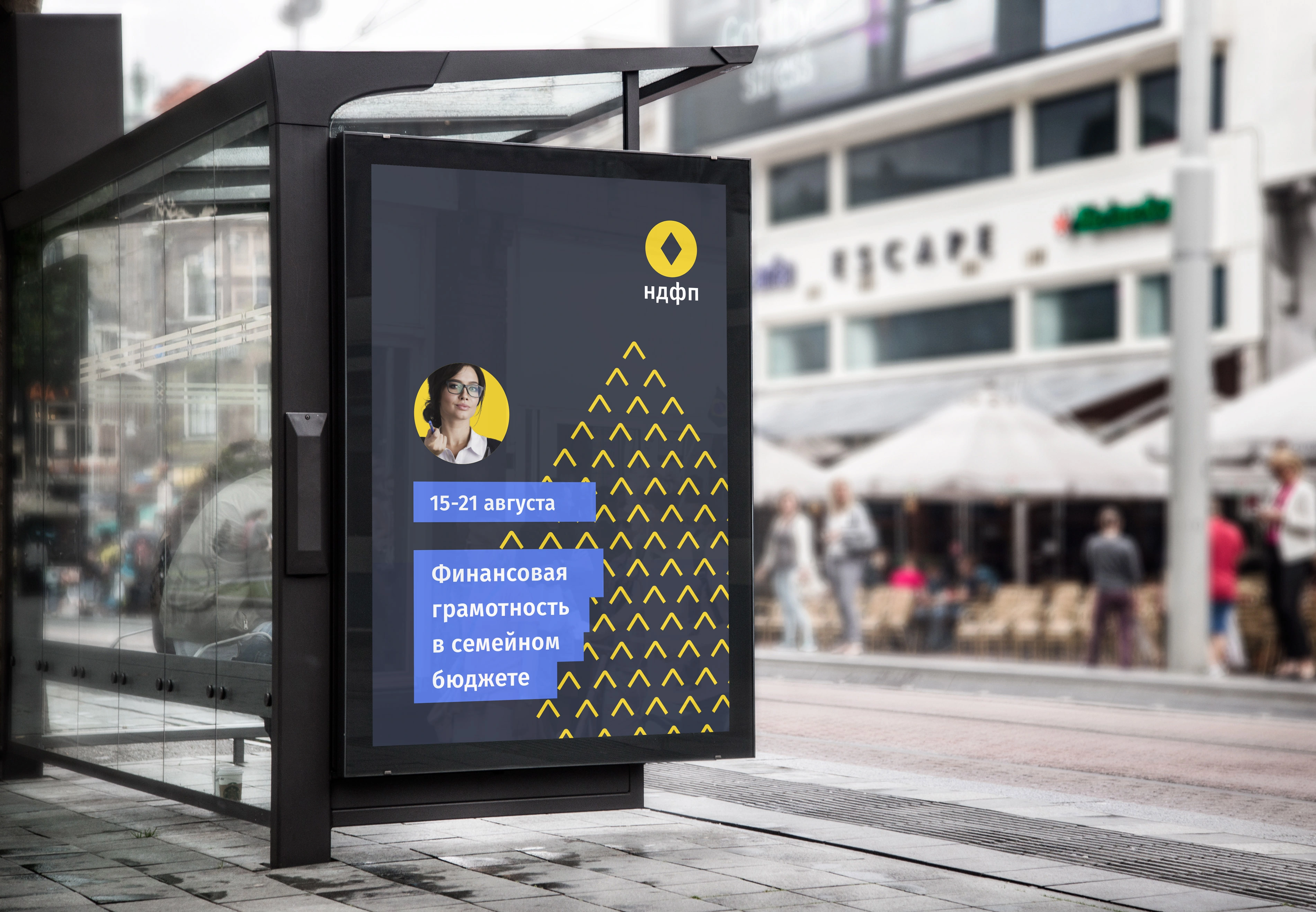
The original working guide: trademark, spacing, colour, typography, imagery, graphics and key applications.
Original structure, design principles and examples for everyday use.
Explore the guideOriginal designs and refreshed presentation mockups show the identity across learning tools, interiors and events.
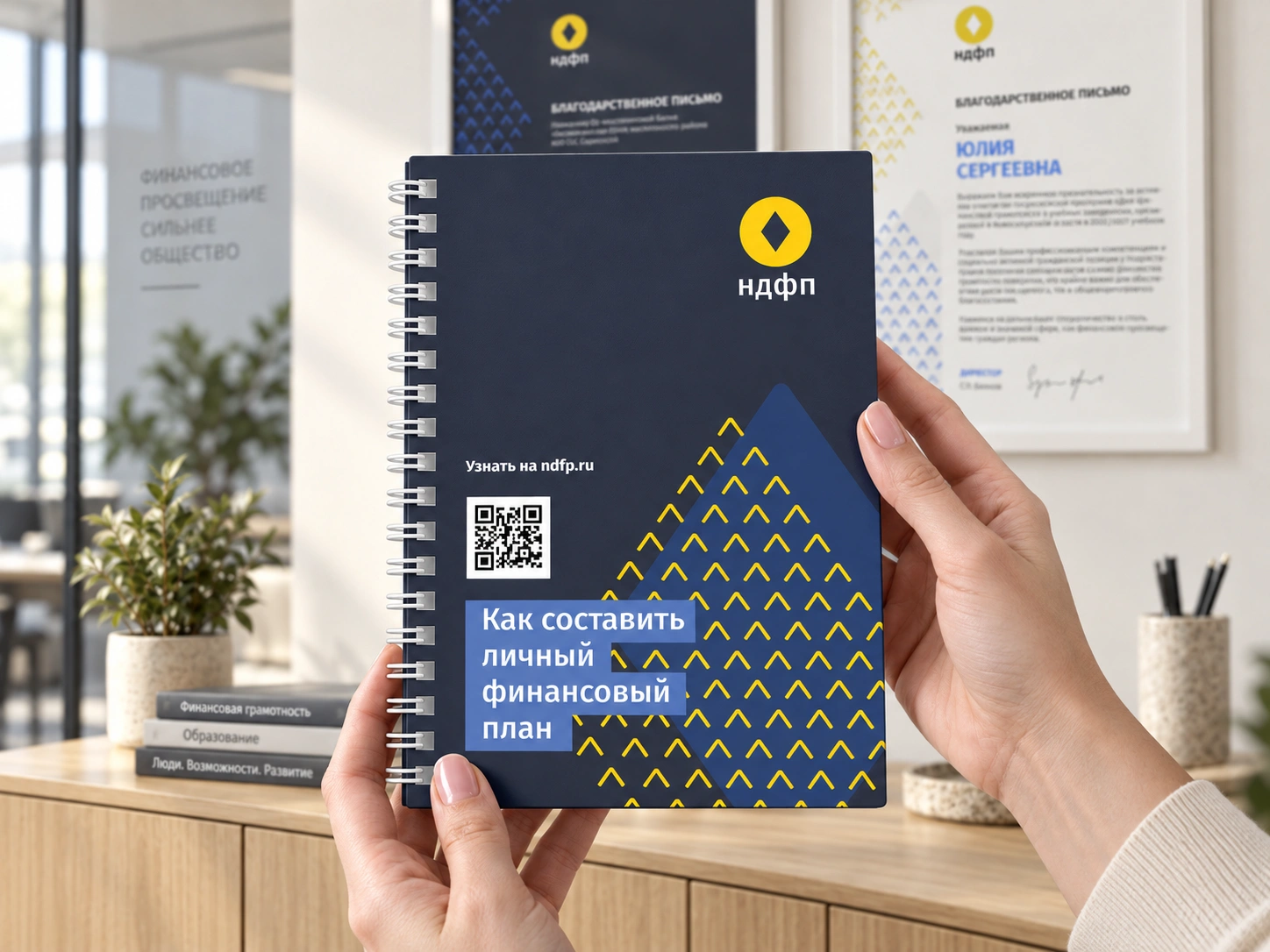
The original notebook design in a new office presentation mockup.
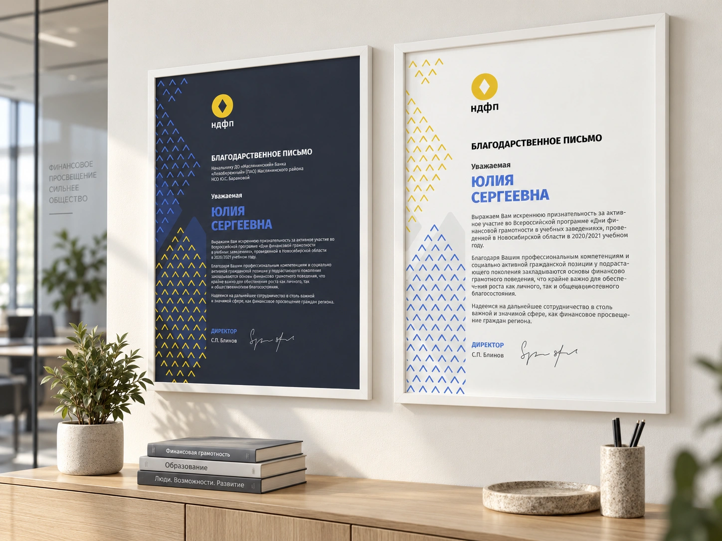
Light and dark certificate designs presented together in a contemporary office mockup.

The original pencil illustration imagined as a wall mural for a learning lounge. Interior concept mockup.

The illustration becomes printed film on a glass office door. Interior concept mockup.
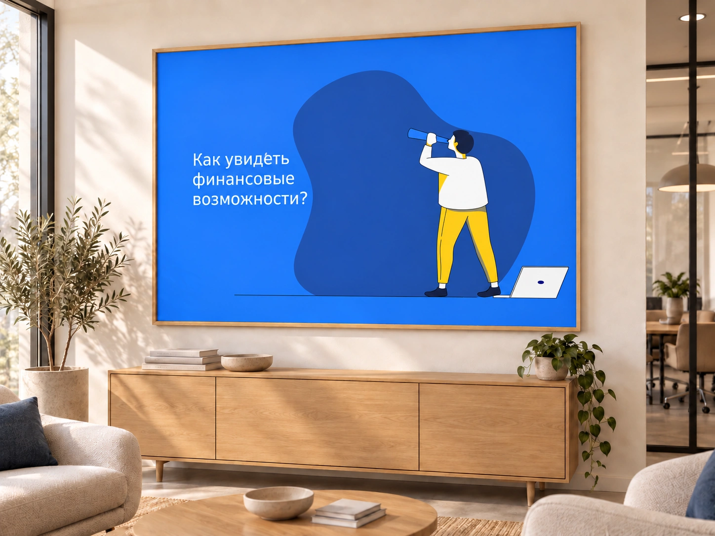
A framed illustration brings the visual language into an office lounge. Interior concept mockup.

Educational icon examples from the guide. These support information without competing with the core arrow graphics.
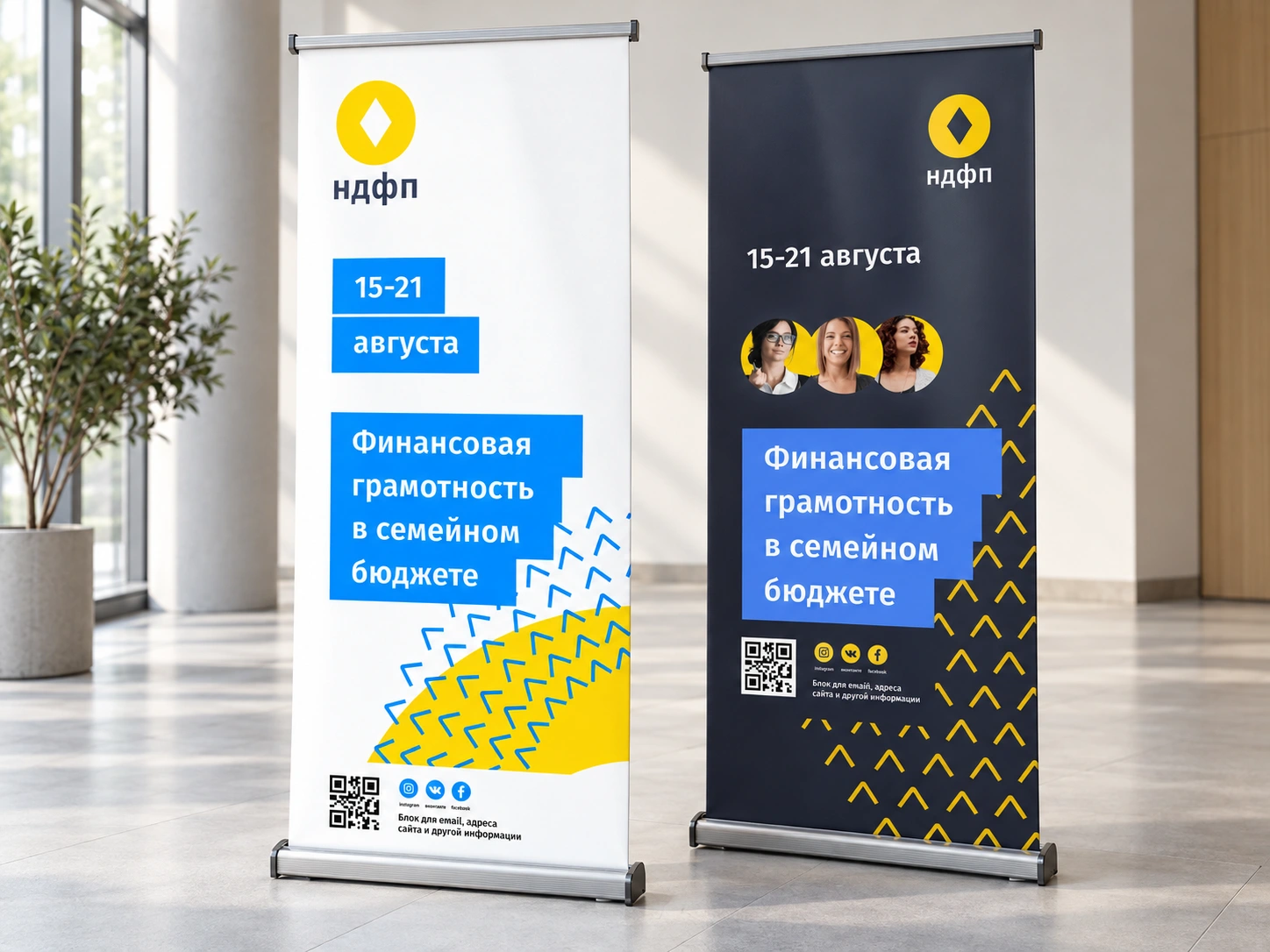
Original light and dark banner designs shown in a new interior presentation mockup.
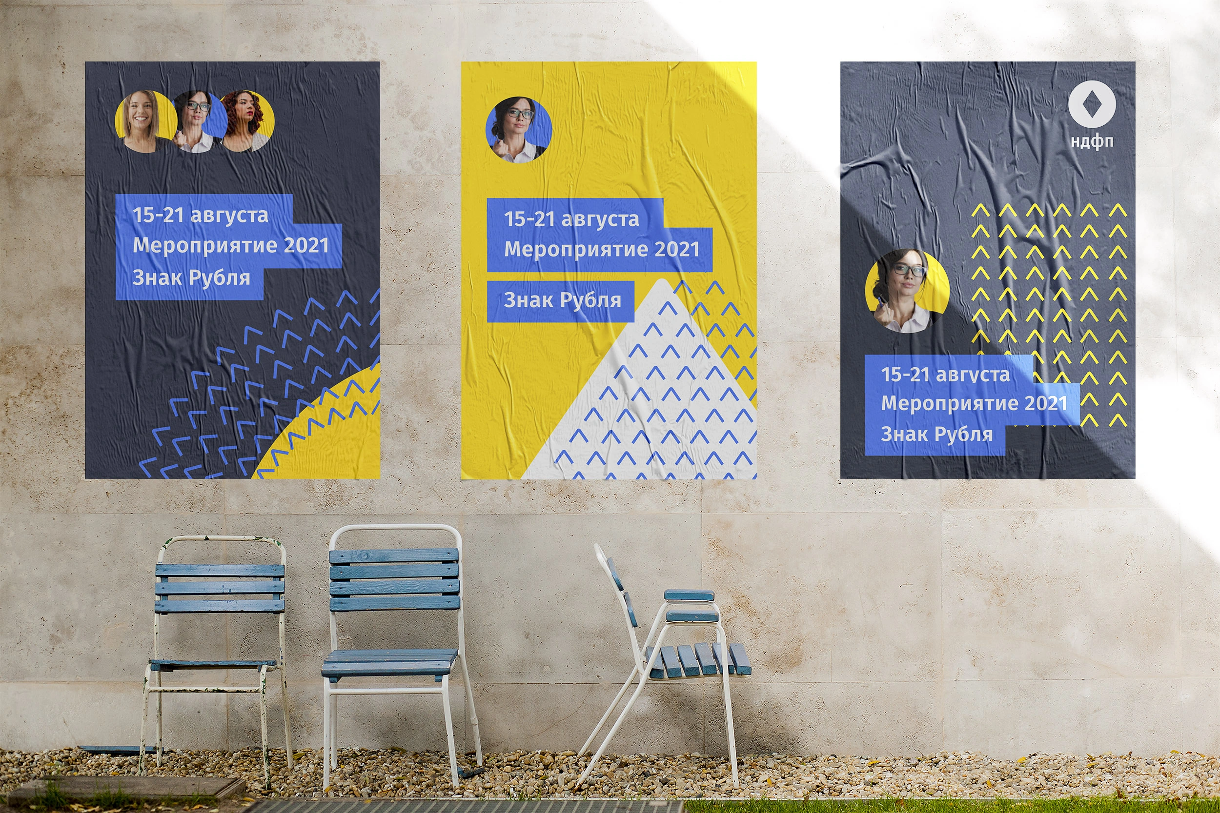
The design materials carry the compass across stationery, learning notebooks, certificates and event communication.
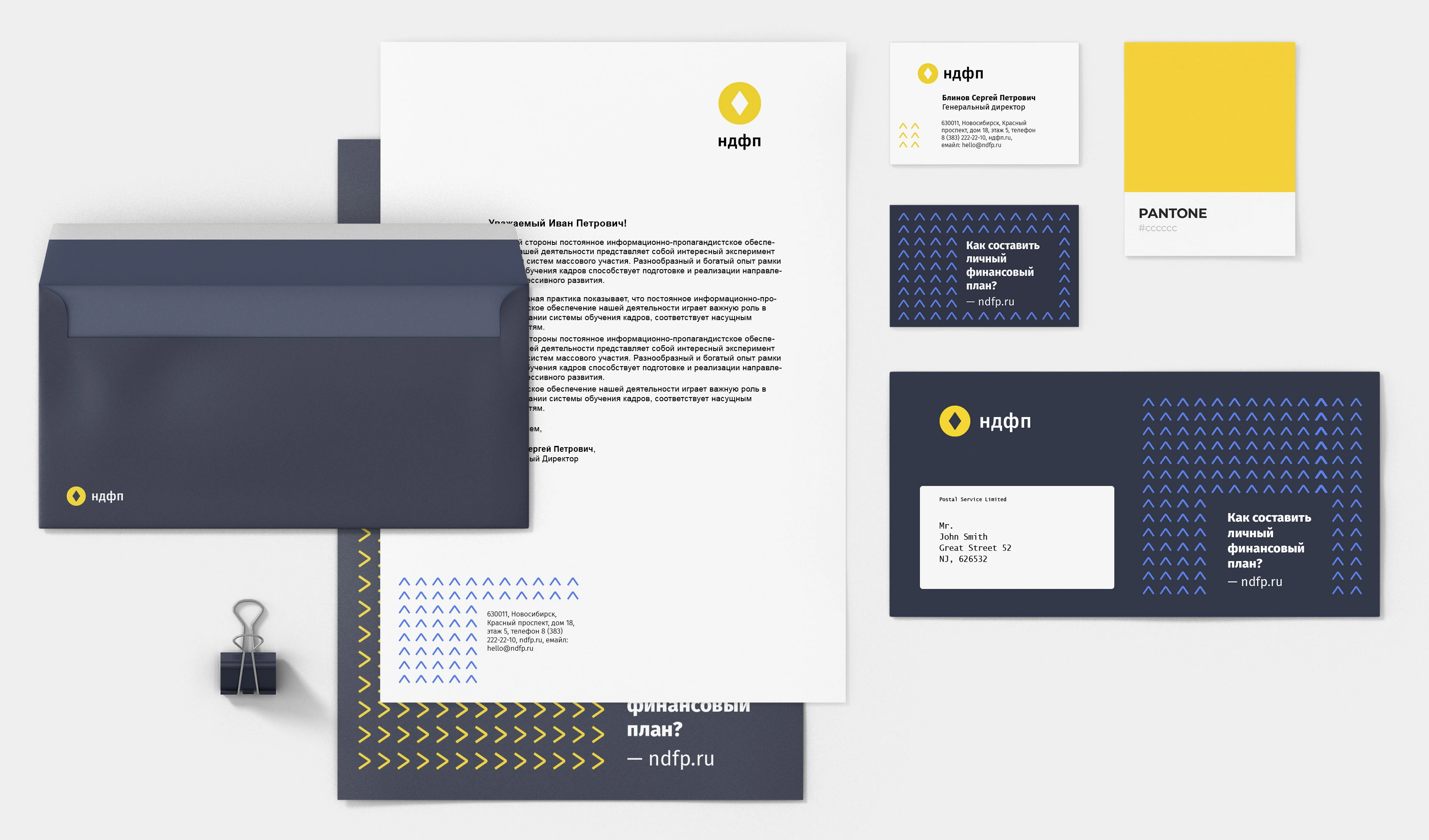
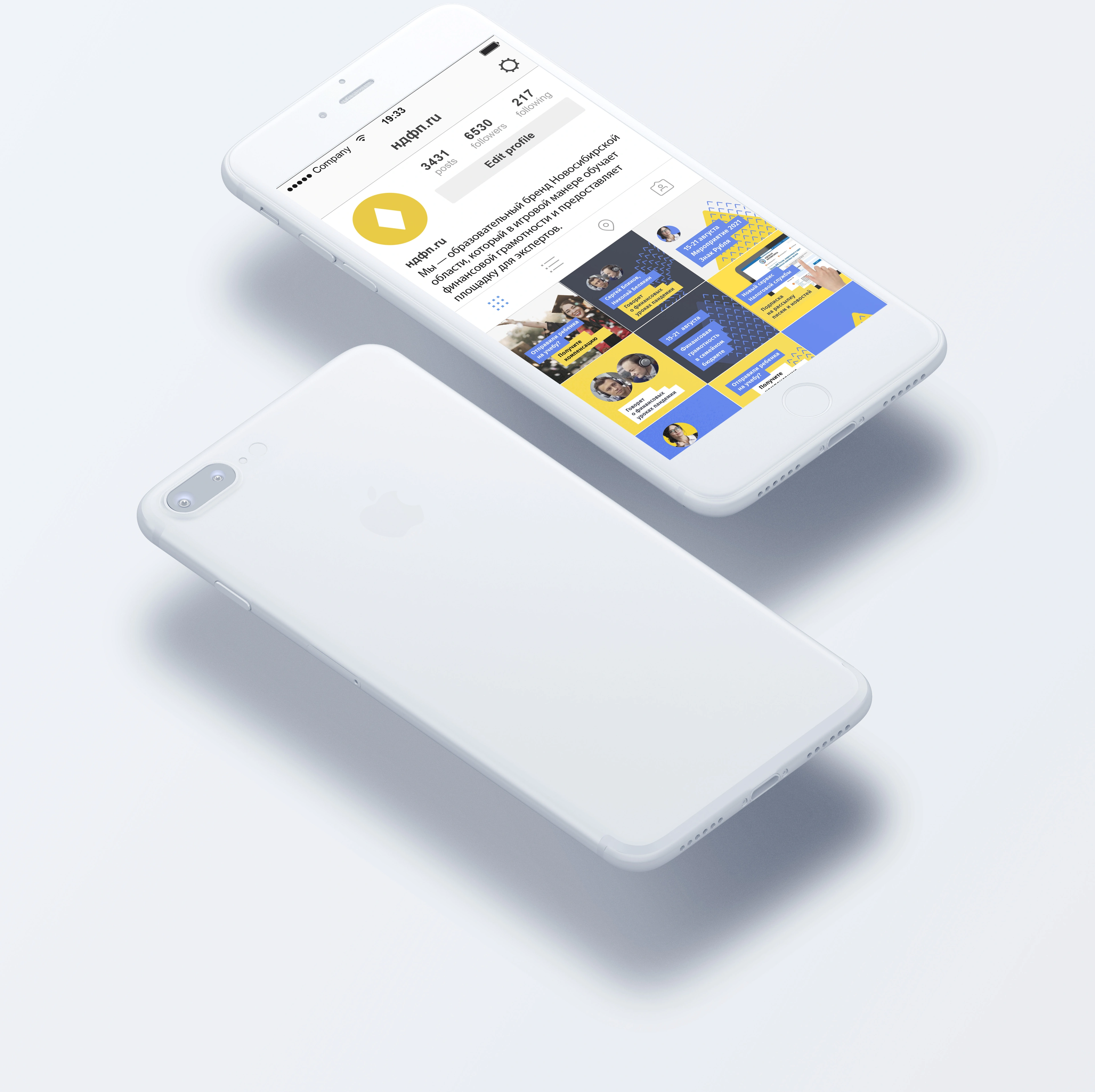
The financial compass connects the organisation’s educational role with a recognisable symbol, a flexible graphic language and practical guidance for the people applying it.
Project archive · 2020. Original artwork and the published guide are presented in Russian. Application images are design presentation mockups.