NDFP / Brand guidelines / 2020

A guide to
clear direction.

The working identity system for the Novosibirsk House of Financial Education. Original rules and artwork, presented in English.

NDFP develops financial literacy projects for children and adults and brings experts together. Its visual and verbal identity follows a shared system: trademark, core elements, typography, colour, imagery and design layouts.

The visual identity at a glance

Trademark

Primary signature

The financial compass and the brand lettering form NDFP’s primary signature.
Use the primary arrangement on horizontal formats and the additional arrangement on vertical formats.
NDFP guideline artwork
Signature on a dark background
Signature on a light background
NDFP guideline artwork

Trademark

Vertical signature

An additional arrangement for vertical formats. The symbol and wordmark share a centred vertical axis.
Recommended for portrait formats.
NDFP guideline artwork

Brand symbol

The financial compass

NDFP’s financial compass consists of two elements: a body and an arrow.
NDFP guideline artwork
The financial compass represents knowledge, principles and a reliable guide through the world of finance.
A financial compass helps people make informed decisions in household finances and in starting and developing a business.
NDFP guideline artwork

Clear space

Minimum spacing

Keep a safe distance between the trademark, other objects and the edges of the format. This is a fundamental rule of the guide.
The financial-compass symbol defines the minimum spacing unit.
The example shows the required distance between the signature and the edge of a letterhead.
Always preserve the clear space.
NDFP guideline artwork
Minimum spacing between the letterhead edge and the signature.

Minimum size

Keep the symbol legible

Make sure the mark remains sharp and readable at small sizes. Observe the minimum symbol size.
Minimum sizes for print and digital applications:
16 pixels is the size of a website favicon and the minimum height of the brand symbol.
— Print: 10 mm
— Screen: 16 px
Important
NDFP guideline artwork

Applications

The signature in use

NDFP guideline artwork

Colour palette

NDFP’s core colours

Gold and anthracite are the primary colours. They define the brand’s personality and emotional expression.
The primary colours connect to the brand symbol. Additional colours support websites, social media and external communication.
NDFP guideline artwork
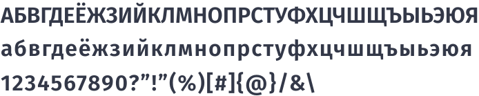
Use the humanist sans serif Fira Sans and the sans serif Roboto in NDFP communication. Set long body text in Roboto; use Fira Sans for headings and short passages.

Typography

Fira Sans and Roboto
NDFP guideline artwork

Typography

Primary typeface

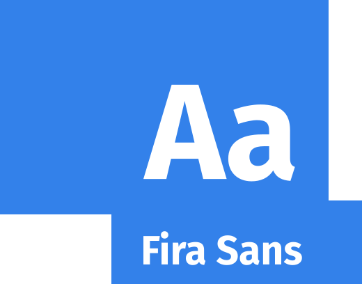
Fira Sans is the brand’s primary typeface.
Fira Sans glyph set
NDFP guideline artwork

Typography

Supporting typeface

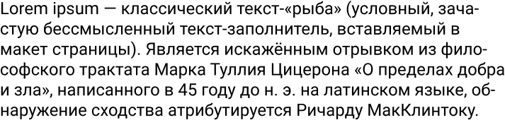
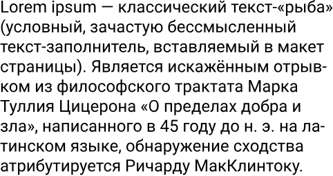
Roboto is the supporting sans serif typeface.
Roboto glyph set
NDFP guideline artwork
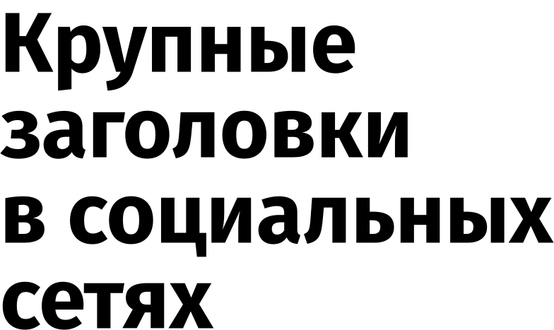
Use Fira Sans for headings and key messages; use Fira Sans and Roboto for subheadings and lower levels of hierarchy.

Type pairing

Typography

NDFP guideline artwork

Brand imagery

Photography

Photography is an important communication tool. NDFP uses photographs in two ways:
— As an image filling the format.
— As an element within a layout.
The second approach is useful for cropping avatars and portraits of speakers and experts.
The photographs in this guide illustrate the intended style.
Important
NDFP guideline artwork

Brand imagery

Icons

Use icons when a suitable photograph is unavailable.
Keep icons secondary: arrows are the key graphic element. Do not combine arrows and icons in one composition.
The icons in this guide illustrate the intended style.
Important
NDFP guideline artwork

Brand imagery

Illustrations

An illustration or coordinated series created for an event can be an ideal way to communicate with the audience.
Avoid combining illustrations with the brand pattern or the main graphic element.
These illustrations demonstrate the intended visual style.
Important
Imagery examples

Graphic system

The diamond and the arrow
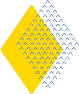
The arrow pattern is the key element of the identity.
NDFP guideline artwork
The arrow is the smallest unit of the pattern. Begin with the diamond: the arrow of the financial compass. Position the arrow diamond so that the viewer always sees two of its vertices.
Develop the pattern into further brand elements. Start by arranging arrows into simple geometric forms: a circle, a ring or a rectangle.
NDFP guideline artwork
The symbol’s shape generates adaptable graphic elements for different formats and media. Use arrows as the key element across NDFP’s main applications.

Key applications

Visual identity

Repeat the element consistently to build a coherent, connected identity.
Important
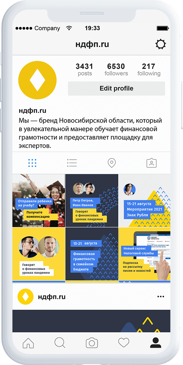
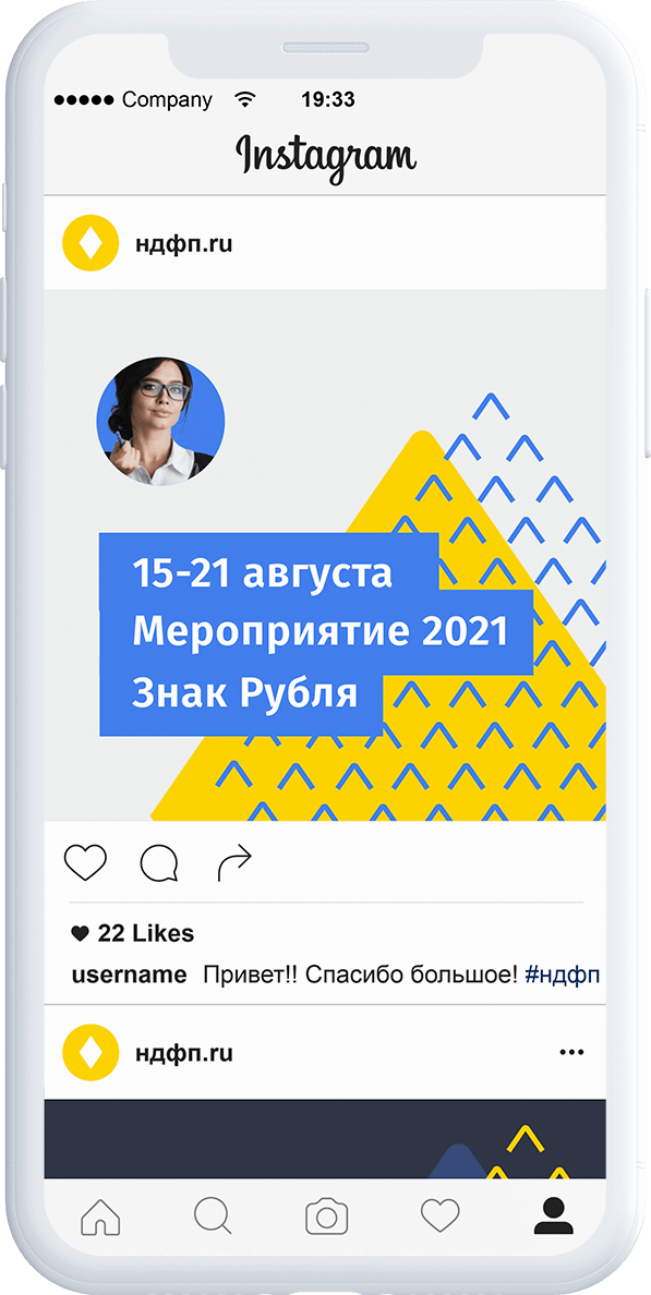
NDFP Instagram profile and coordinated publication gridNDFP Instagram event publication template
Key applications

Instagram design

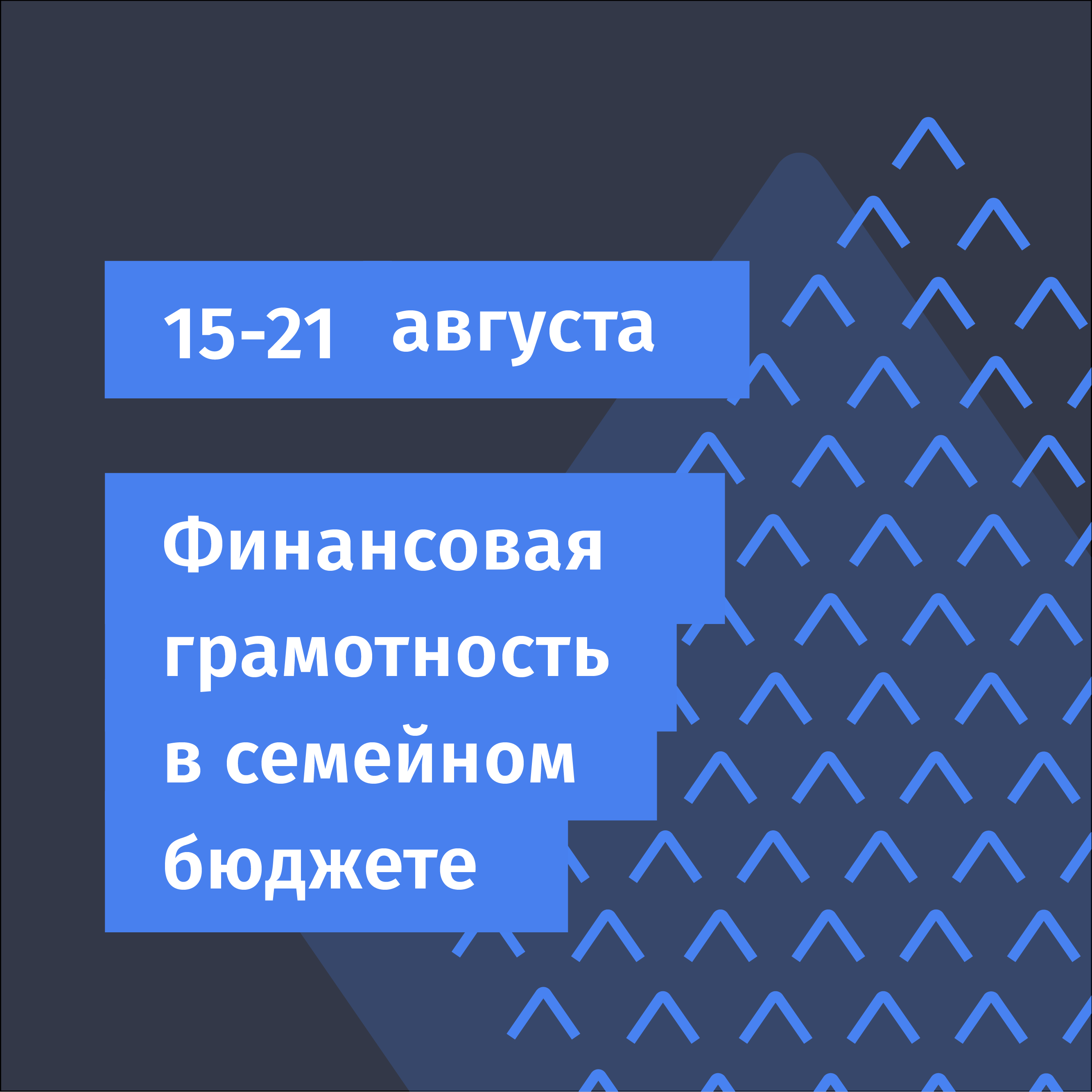
The profile and individual posts work as one visual system. Gold, blue and anthracite connect the feed to NDFP’s identity, while the arrow pattern gives each publication a recognisable frame.

Coordinated templates bring event announcements, expert portraits and educational messages into the same family. Clear headings and a consistent hierarchy keep the main information easy to find as the content changes.

Use the shared layouts to prepare new publications, keeping the brand colours, typography and graphic elements consistent.

Templates created in Canva
Key applications

Roll-up display

As a public organisation, NDFP regularly takes part in exhibitions and events. Portable roll-up displays help it create a recognisable presence wherever it meets its audience.

Every display belongs to the same visual family as the organisation’s other materials. The financial-compass symbol, brand colours, typography and arrow pattern keep the identity consistent across different venues and formats.

Light and dark layouts offer two expressions of the same system. Event dates, themes and speaker portraits can change while the shared design makes each display unmistakably NDFP.

Download the design (PDF)
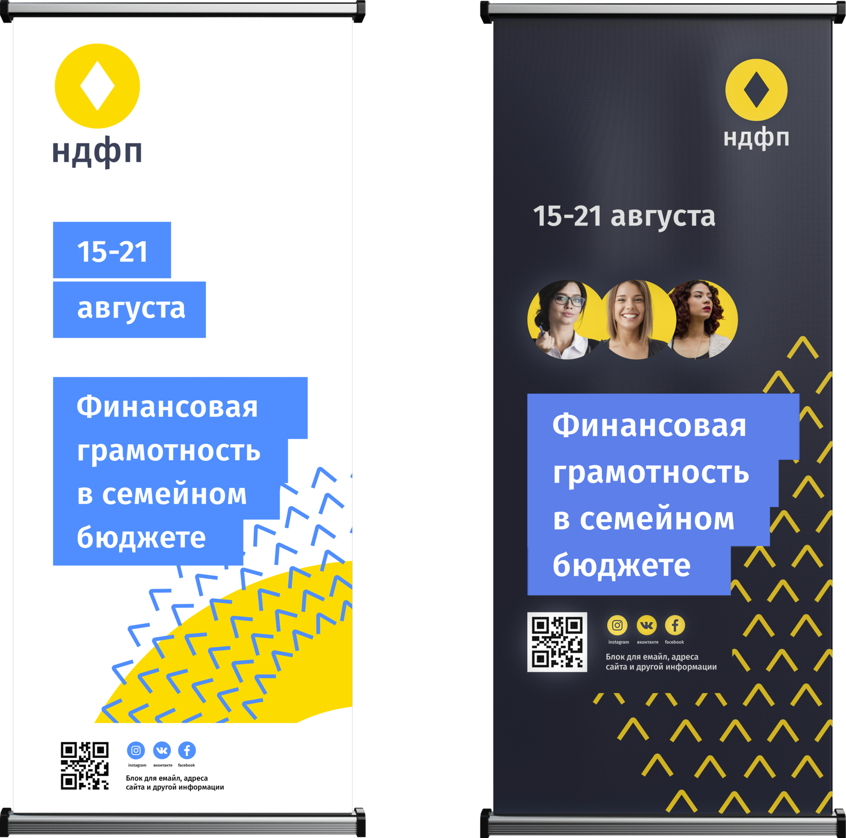
NDFP roll-up displays in coordinated light and dark designs
NDFP guideline artwork

Key applications

Letterhead and business cards
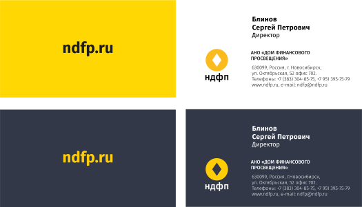
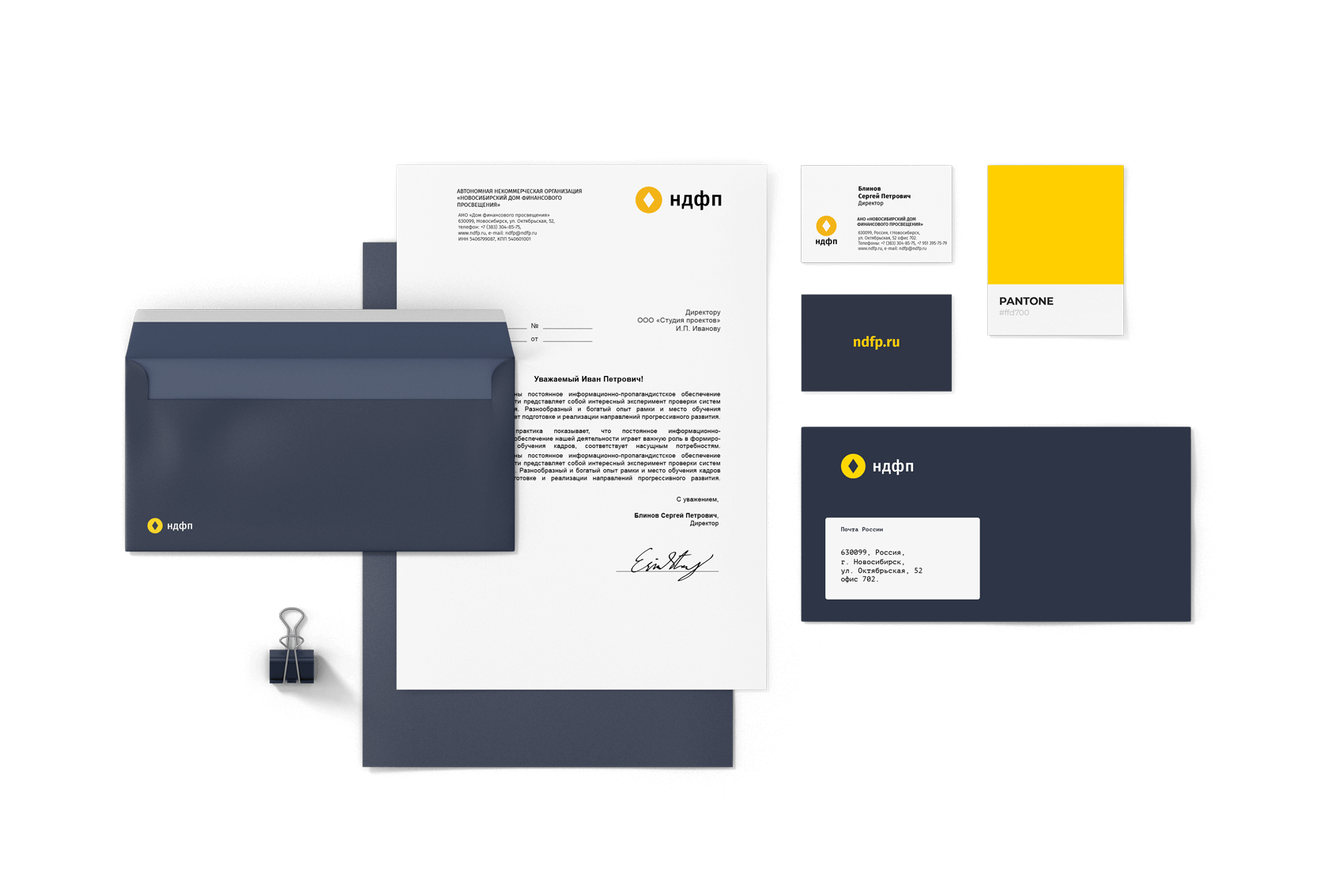
NDFP uses digitally printed white coated business cards and dark grey designer card printed with screen printing.
NDFP guideline artwork
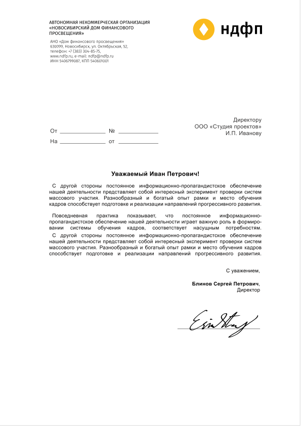
Use letterheads without the main arrow graphic.
NDFP guideline artwork
NDFP application design

Brand imagery

Notebook design

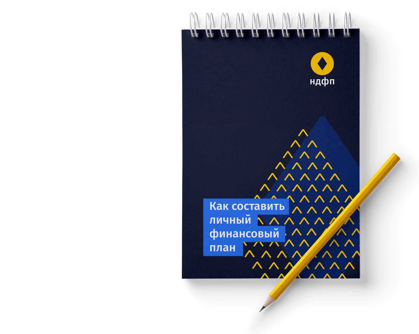
Use the arrow diamond — the key element of NDFP’s identity — on notebook covers.
NDFP guideline artwork
Covers can be monochrome for screen printing or multicolour for digital printing.

Brand imagery

Letters of appreciation

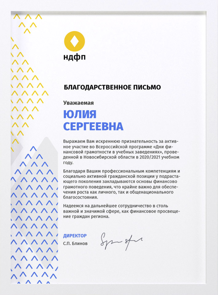
Certificates, diplomas and letters of appreciation use the key graphic element of the identity.
NDFP guideline artwork
Begin with the arrow diamond to build brand recognition and keep communication coherent.
NDFP application design